
Étendre ggplot2
- Nouvelles géométries
- Étiquettes non superposées
- Graphiques en sucettes (lollipop)
- Graphique d’haltères (dumbbell)
- Points reliés (pointpath)
- Accolades de comparaison (bracket)
- Diagramme en crêtes (ridges)
- Graphique en gaufres (waffle)
- Graphique en mosaïque (mosaic plot)
- Représentations graphiques des distributions et de l’incertitude
- Graphique de pirates : alternative aux boîtes à moustache (pirat plot)
- Nuages de pluie (raincloud plots)
- Demi-géométries
- Annotations avec des formes gémoétriques
- Axes, légende et facettes
- Cartes
- Graphiques complexes
- Thèmes et couleurs
- Combiner plusieurs graphiques
Ce chapitre est évoqué dans le webin-R #13 (exemples de graphiques avancés) sur YouTube.
Ce chapitre est évoqué dans le webin-R #14 (exemples de graphiques avancés - 2) sur YouTube.
De nombreuses extensions permettent d’étendre les possibilités graphiques de ggplot2. Certaines ont déjà été abordées dans les différents chapitres d’analyse-R. Le présent chapitre ne se veut pas exhaustif et ne présente qu’une sélection choisie d’extensions.
Le site ggplot2 extensions (https://exts.ggplot2.tidyverse.org/gallery/) recense diverses extensions pour ggplot2.
Pour une présentation des fonctions de base et des concepts de ggplot2, on pourra se référer au chapitre dédié ainsi qu’au deux chapitres introductifs : introduction à ggplot2 et graphiques bivariés avec ggplot2.
Pour trouver l’inspiration et des exemples de code, rien ne vaut l’excellent site https://www.r-graph-gallery.com/.
Nouvelles géométries
Étiquettes non superposées
Lorsque l’on affiche des étiquettes de texte, ces dernières peuvent se supperposer lorsqu’elles sont proches. Les géométries geom_text_repel et geom_label_repel de l’extension ggrepel prennent en compte la position des différentes étiquettes pour éviter qu’elles ne se chevauchent.
library(ggplot2)
library(ggrepel)
library(ggrepel)

dat <- subset(mtcars, wt > 2.75 & wt < 3.45)
dat$car <- rownames(dat)
p <- ggplot(dat) +
  aes(wt, mpg, label = car) +
  geom_point(color = "red")

p1 <- p + geom_text() +
  labs(title = "geom_text()")
p2 <- p + geom_text_repel() +
  labs(title = "geom_text_repel()")

cowplot::plot_grid(p1, p2, nrow = 1)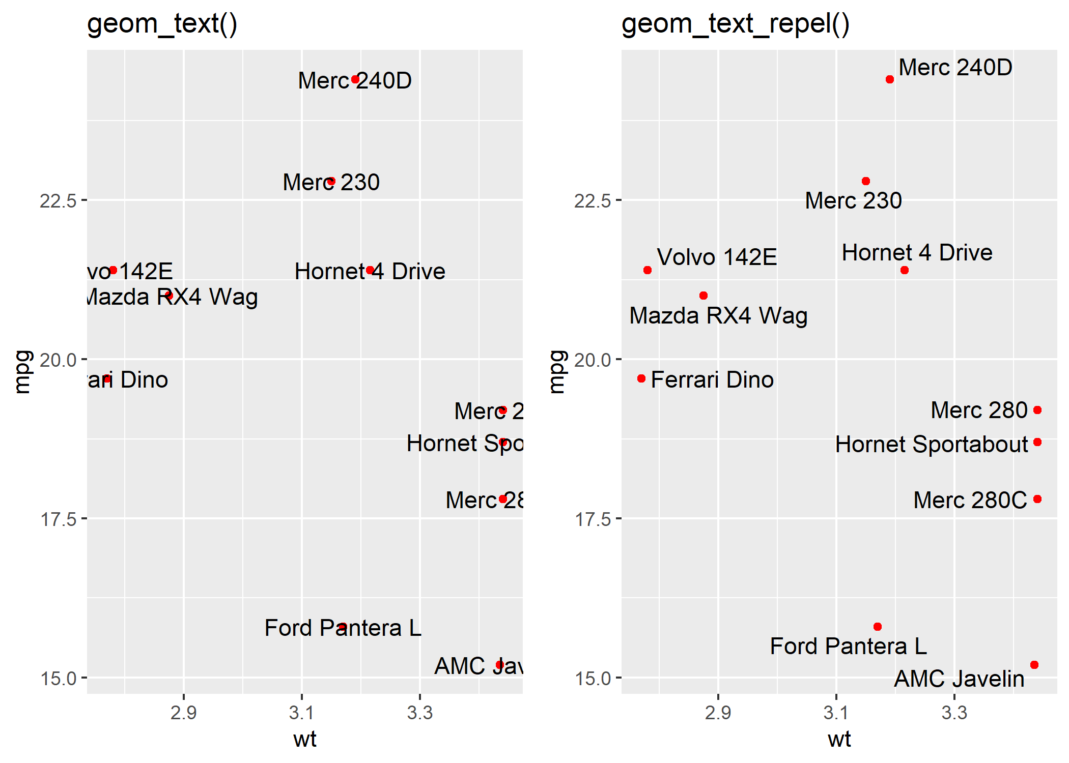
Pour plus d’informations : https://ggrepel.slowkow.com/
Graphiques en sucettes (lollipop)
L’extension ggalt propose une géométrie geom_lollipop permettant de réaliser des graphiques dit en sucettes
.
df <- read.csv(text = "category,pct
Other,0.09
South Asian/South Asian Americans,0.12
Interngenerational/Generational,0.21
S Asian/Asian Americans,0.25
Muslim Observance,0.29
Africa/Pan Africa/African Americans,0.34
Gender Equity,0.34
Disability Advocacy,0.49
European/European Americans,0.52
Veteran,0.54
Pacific Islander/Pacific Islander Americans,0.59
Non-Traditional Students,0.61
Religious Equity,0.64
Caribbean/Caribbean Americans,0.67
Latino/Latina,0.69
Middle Eastern Heritages and Traditions,0.73
Trans-racial Adoptee/Parent,0.76
LBGTQ/Ally,0.79
Mixed Race,0.80
Jewish Heritage/Observance,0.85
International Students,0.87", stringsAsFactors = FALSE, sep = ",", header = TRUE)

library(ggplot2)
library(ggalt)
library(scales)

ggplot(df) +
  aes(y = reorder(category, pct), x = pct) +
  geom_lollipop(point.colour = "steelblue", point.size = 2, horizontal = TRUE) +
  scale_x_continuous(expand = c(0, 0), labels = percent, breaks = seq(0, 1, by = 0.2), limits = c(0, 1)) +
  labs(
    x = NULL, y = NULL,
    title = "SUNY Cortland Multicultural Alumni survey results",
    subtitle = "Ranked by race, ethnicity, home land and orientation\namong the top areas of concern",
    caption = "Data from http://stephanieevergreen.com/lollipop/"
  ) +
  theme_minimal()
Warning: Using the `size` aesthetic with geom_segment was deprecated
in ggplot2 3.4.0.
ℹ Please use the `linewidth` aesthetic instead.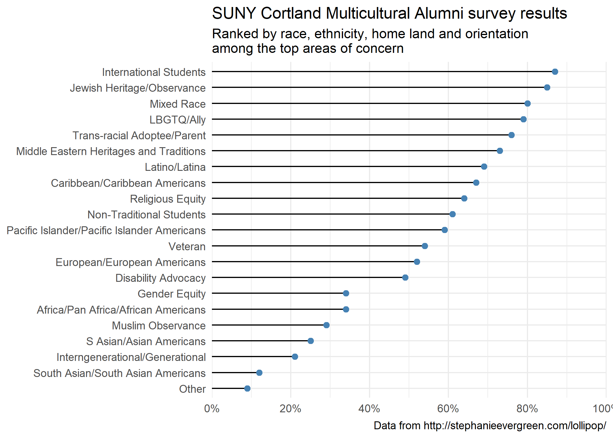
Graphique d’haltères (dumbbell)
L’extension ggalt propose une géométrie geom_dumbbell permettant de réaliser des graphiques dit en haltères
.
library(ggalt)
df <- data.frame(
  trt = LETTERS[1:5],
  l = c(20, 40, 10, 30, 50),
  r = c(70, 50, 30, 60, 80)
)

ggplot(df) +
  aes(y = trt, x = l, xend = r) +
  geom_dumbbell(
    size = 3,
    color = "#e3e2e1",
    colour_x = "#5b8124",
    colour_xend = "#bad744"
  ) +
  labs(x = NULL, y = NULL) +
  theme_minimal()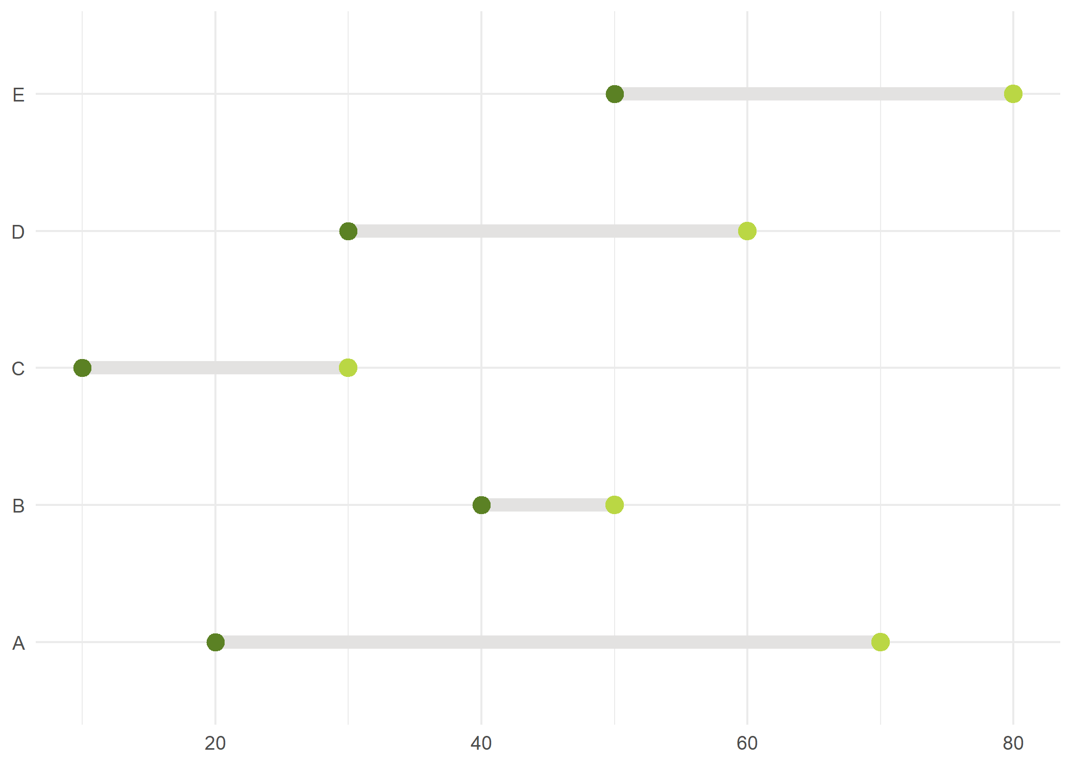
Points reliés (pointpath)
L’extension ggh4x propose une géométrie geom_pointpath pour afficher des points reliés entre eux par un tiret. La géométrie geom_pointpath est également proposée par l’extension lemon.
Accolades de comparaison (bracket)
La géométrie geom_braket de l’extension ggpubr permets d’ajouter sur un graphique des accolades de comparaison entre groupes.
library(ggpubr)
df <- ToothGrowth
df$dose <- factor(df$dose)

ggplot(df) +
  aes(x = dose, y = len) +
  geom_boxplot() +
  geom_bracket(
    xmin = "0.5", xmax = "1", y.position = 30,
    label = "t-test, p < 0.05"
  )
ggplot(df) +
  aes(x = dose, y = len) +
  geom_boxplot() +
  geom_bracket(
    xmin = c("0.5", "1"),
    xmax = c("1", "2"),
    y.position = c(30, 35),
    label = c("***", "**"),
    tip.length = 0.01
  )
Plus d’informations : https://rpkgs.datanovia.com/ggpubr/
Diagramme en crêtes (ridges)
L’extension ggridges fournit une géométrie geom_density_ridges_gradient pour la création de diagramme en crêtes.
library(ggridges)
ggplot(lincoln_weather, aes(x = `Mean Temperature [F]`, y = Month, fill = stat(x))) +
  geom_density_ridges_gradient(scale = 3, rel_min_height = 0.01) +
  scale_fill_viridis_c(name = "Temp. [F]", option = "C") +
  labs(title = "Temperatures in Lincoln NE in 2016") +
  theme_ridges()
Warning: `stat(x)` was deprecated in ggplot2 3.4.0.
ℹ Please use `after_stat(x)` instead.Picking joint bandwidth of 3.37
Plus d’informations : https://wilkelab.org/ggridges/
Graphique en gaufres (waffle)
L’extension waffle propose geom_waffle pour des graphiques dits en gaufres
.
ATTENTION : elle s’installe avec la commande install.packages("waffle", repos = "https://cinc.rud.is").
library(waffle)
xdf <- data.frame(
  parts = factor(rep(month.abb[1:3], 3), levels = month.abb[1:3]),
  vals = c(10, 20, 30, 6, 14, 40, 30, 20, 10),
  fct = c(rep("Thing 1", 3), rep("Thing 2", 3), rep("Thing 3", 3))
)

ggplot(xdf) +
  aes(fill = parts, values = vals) +
  geom_waffle() +
  facet_wrap(~fct) +
  scale_fill_manual(
    name = NULL,
    values = c("#a40000", "#c68958", "#ae6056"),
    labels = c("Fruit", "Sammich", "Pizza")
  ) +
  coord_equal() +
  theme_minimal() +
  theme_enhance_waffle()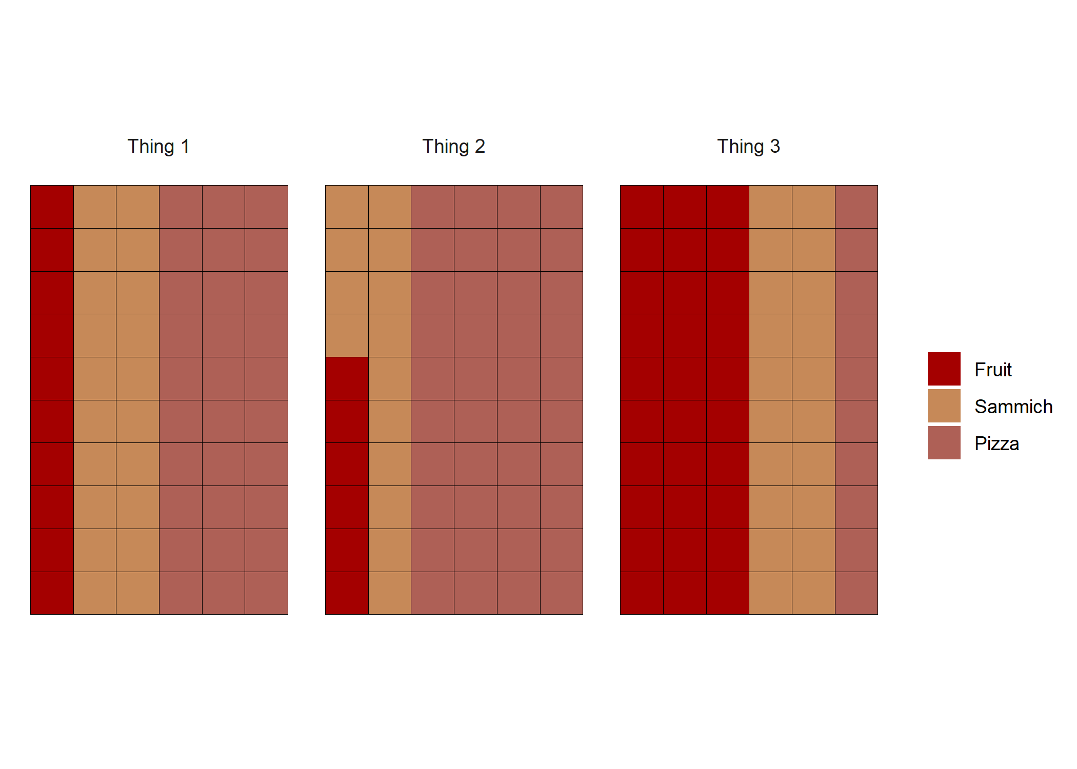
Plus d’informations : https://github.com/hrbrmstr/waffle
Graphique en mosaïque (mosaic plot)
L’extension ggmosaic permets de réaliser des graphiques en mosaïque avec geom_mosaic.
library(ggmosaic)
data(titanic)

ggplot(data = titanic) +
  geom_mosaic(aes(x = product(Class), fill = Survived))
Warning: `unite_()` was deprecated in tidyr 1.2.0.
ℹ Please use `unite()` instead.
ℹ The deprecated feature was likely used in the ggmosaic
package.
Please report the issue at
<]8;;https://github.com/haleyjeppson/ggmosaichttps://github.com/haleyjeppson/ggmosaic]8;;>.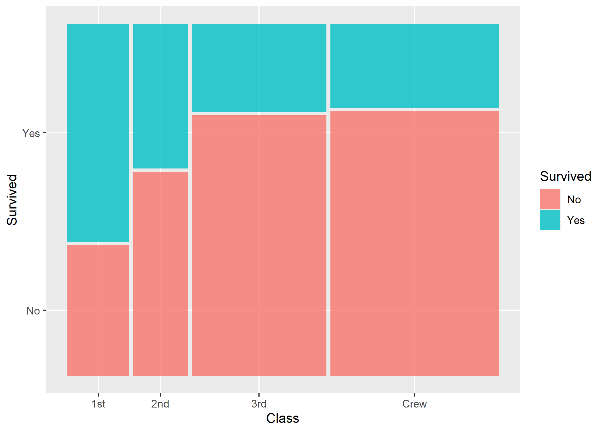
Plus d’informations : https://cran.r-project.org/web/packages/ggmosaic/vignettes/ggmosaic.html
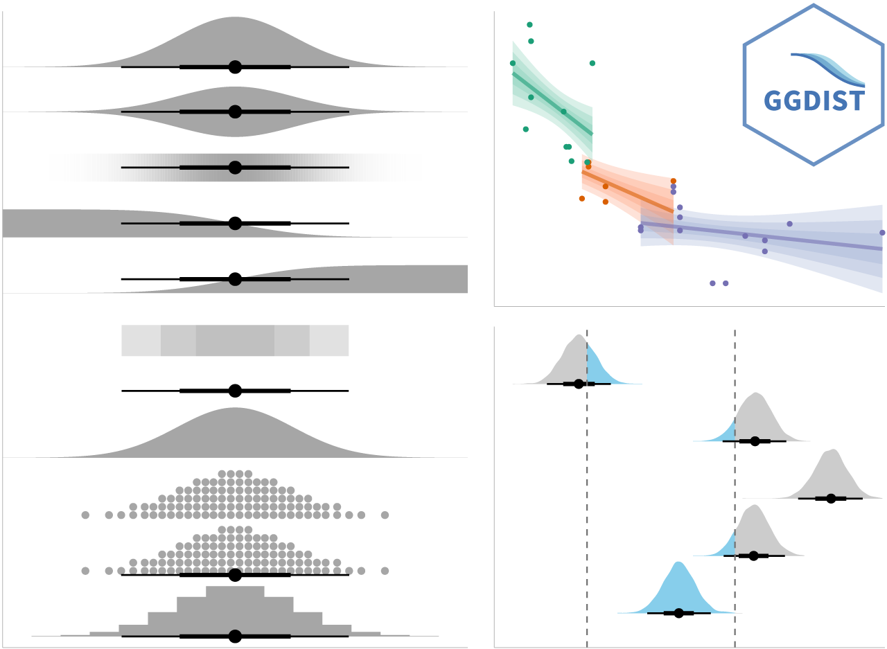
Représentations graphiques des distributions et de l’incertitude
L’extension ggdist propose plusieurs géométries permettant de représenter l’incertitude autour de certaines mesures.
Graphique de pirates : alternative aux boîtes à moustache (pirat plot)
Cette représentation alternative aux boîtes à moustache s’obtient avec la géométrie geom_pirate de l’extension ggpirate1.
library(ggplot2)
library(ggpirate)
ggplot(mpg, aes(x = class, y = cty)) +
  geom_pirate(aes(colour = class, fill = class)) +
  theme_bw()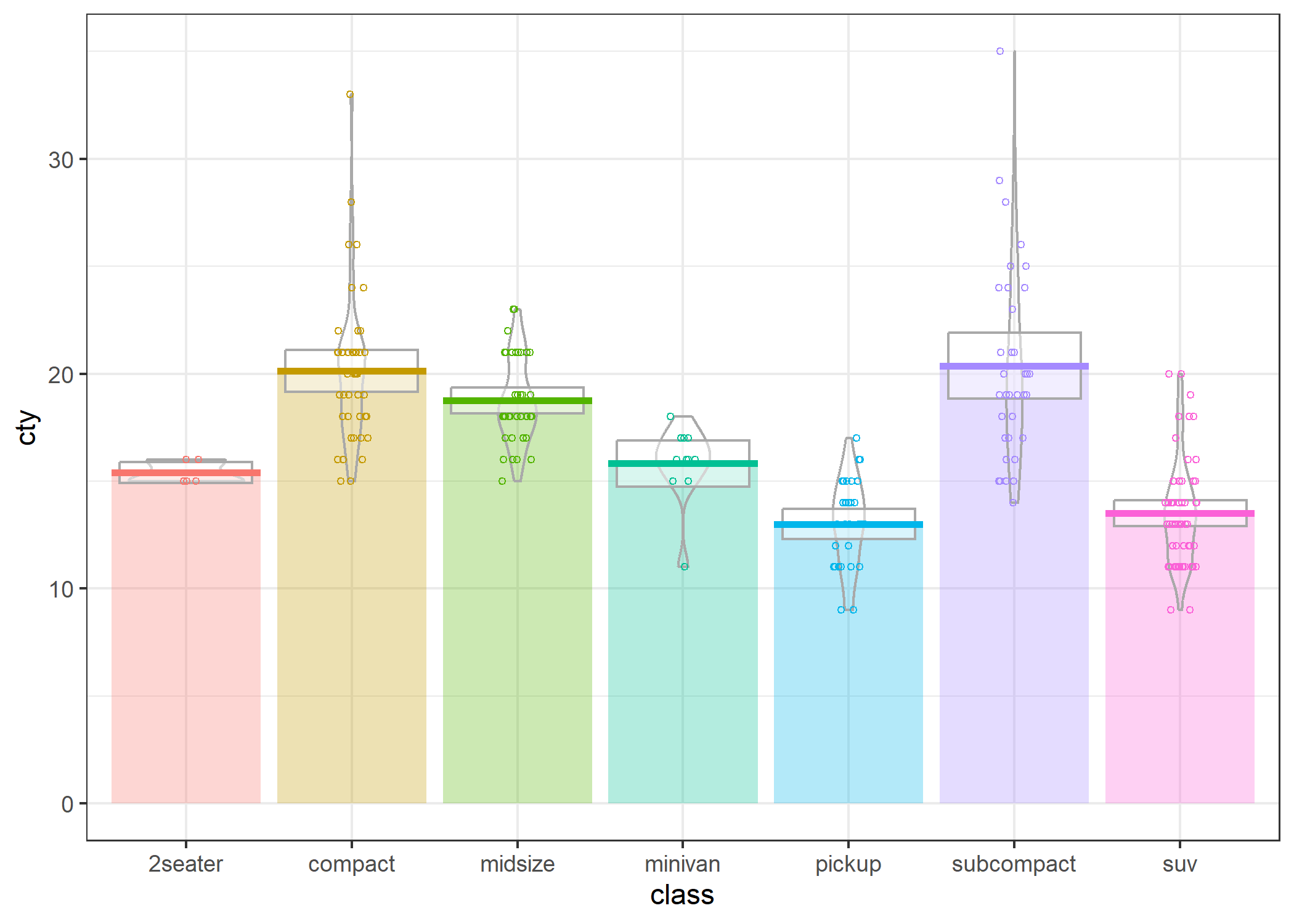
Pour plus d’informations : https://github.com/mikabr/ggpirate
Nuages de pluie (raincloud plots)
Il existe encore d’autres approches graphiques pour mieux rendre compte visuellement différentes distrubutions comme les raincloud plots. Pour en savoir plus, on pourra se référer à un billet de blog en anglais de Cédric Scherer ou encore à l’extension raincloudplots.
Demi-géométries
L’extension gghalves propose des demi-géométries
qui peuvent être combinées entre elles.
library(gghalves)
ggplot(iris, aes(x = Species, y = Sepal.Width)) +
  geom_half_boxplot(fill = "lightblue") +
  geom_half_violin(side = "r", fill = "navajowhite")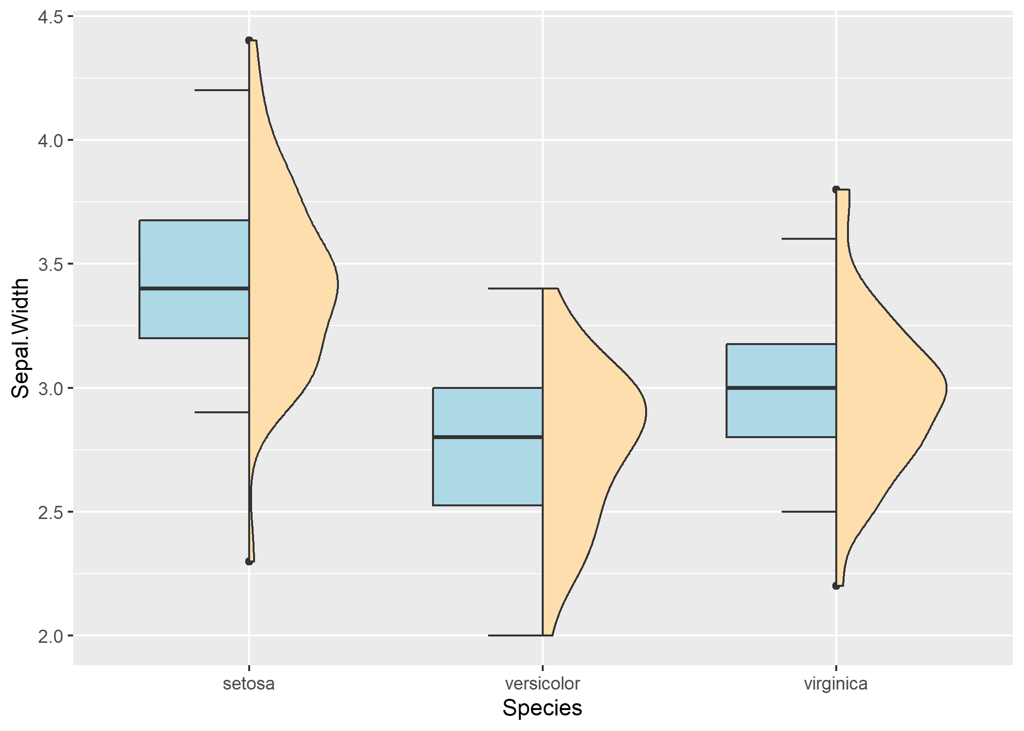
Annotations avec des formes gémoétriques
L’extension ggforce fournie plusieurs géométries permettant d’annoter les points d’un nuage : geom_mark_circle, geom_mark_ellipse, geom_mark_rect et geom_mark_hull.
library(ggforce)
ggplot(iris, aes(Petal.Length, Petal.Width)) +
  geom_mark_rect(aes(fill = Species, label = Species)) +
  geom_point()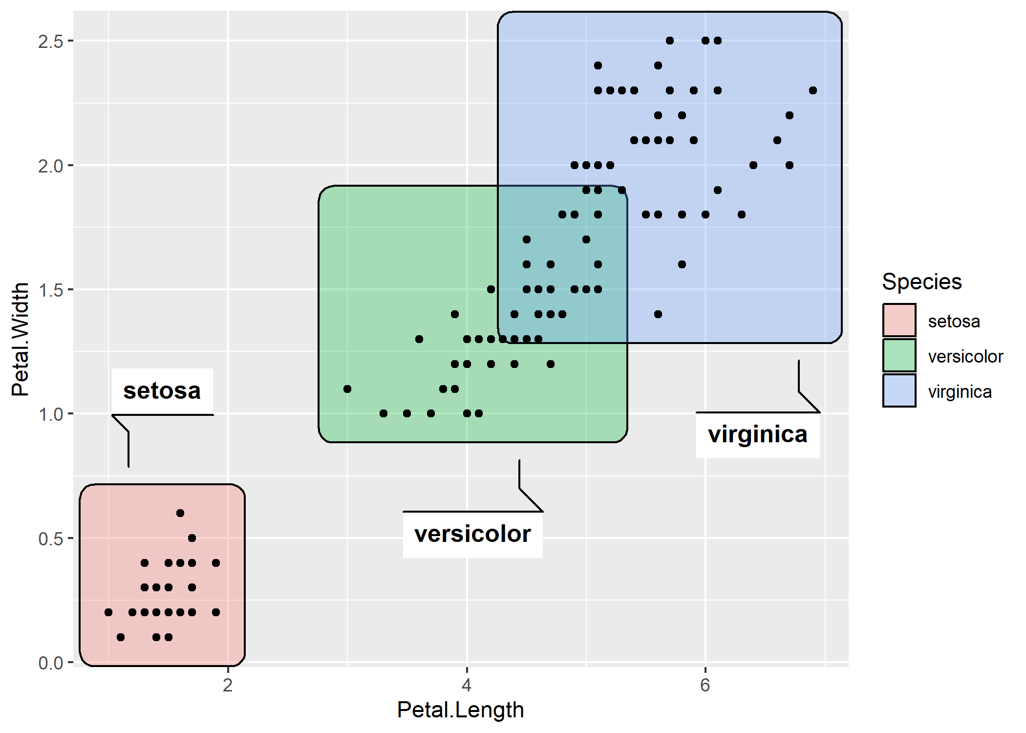
ggplot(iris, aes(Petal.Length, Petal.Width)) +
  geom_mark_hull(aes(fill = Species, label = Species)) +
  geom_point()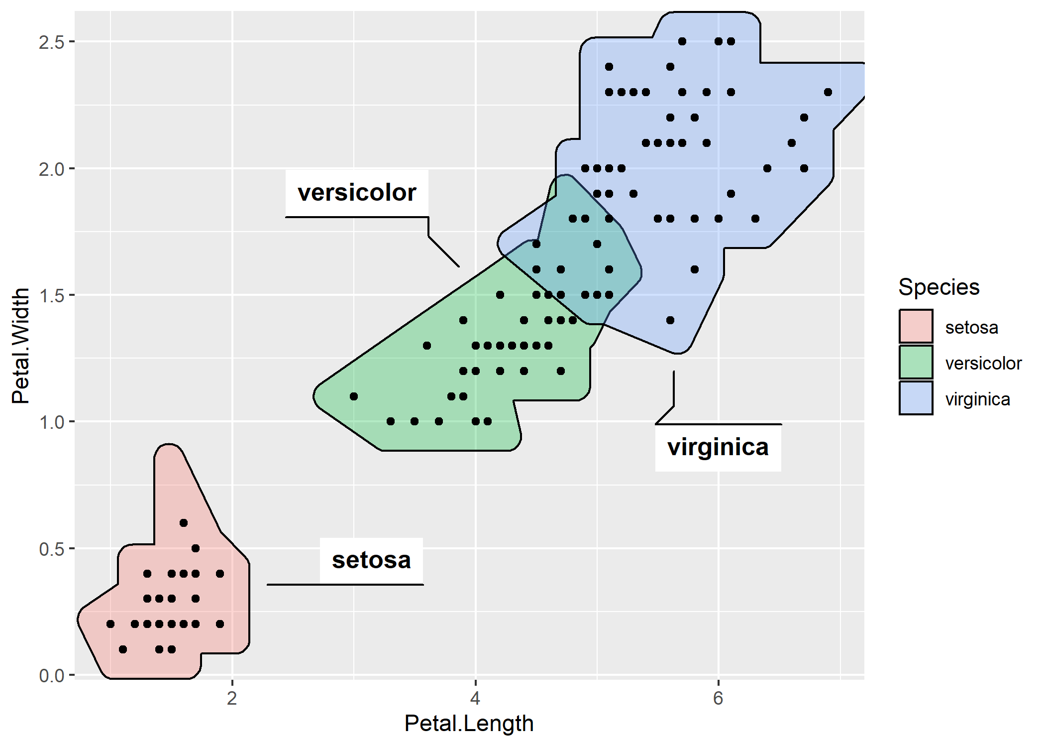
Axes, légende et facettes
Texte mis en forme
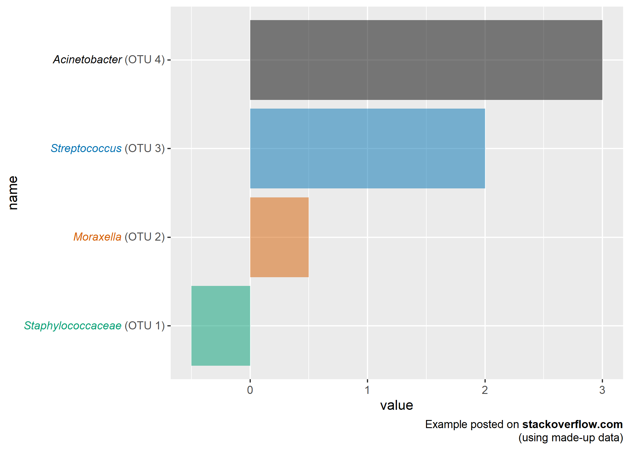
L’extension ggtext permet d’utiliser du markdown et du HTML pour une mise en forme avancée de texte (axes, titres, légendes…).
library(ggtext)

library(tidyverse)
library(ggtext)
library(glue)

data <- tibble(
  bactname = c("Staphylococcaceae", "Moraxella", "Streptococcus", "Acinetobacter"),
  OTUname = c("OTU 1", "OTU 2", "OTU 3", "OTU 4"),
  value = c(-0.5, 0.5, 2, 3)
)

data %>%
  mutate(
    color = c("#009E73", "#D55E00", "#0072B2", "#000000"),
    name = glue("<i style='color:{color}'>{bactname}</i> ({OTUname})"),
    name = fct_reorder(name, value)
  ) %>%
  ggplot(aes(value, name, fill = color)) +
  geom_col(alpha = 0.5) +
  scale_fill_identity() +
  labs(caption = "Example posted on **stackoverflow.com**<br>(using made-up data)") +
  theme(
    axis.text.y = element_markdown(),
    plot.caption = element_markdown(lineheight = 1.2)
  )
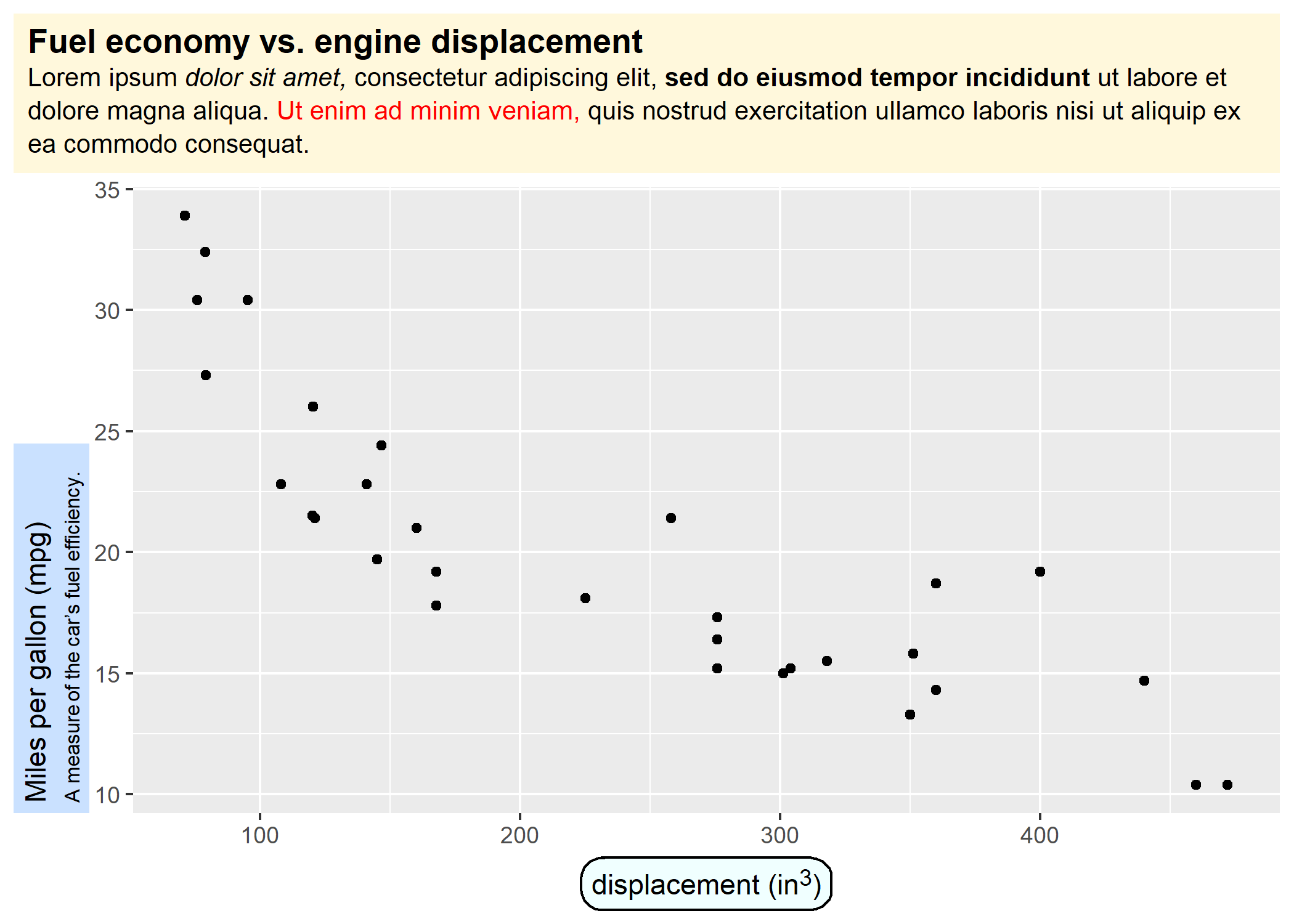
ggplot(mtcars, aes(disp, mpg)) +
  geom_point() +
  labs(
    title = "<b>Fuel economy vs. engine displacement</b><br>
    <span style = 'font-size:10pt'>Lorem ipsum *dolor sit amet,*
    consectetur adipiscing elit, **sed do eiusmod tempor incididunt** ut
    labore et dolore magna aliqua. <span style = 'color:red;'>Ut enim
    ad minim veniam,</span> quis nostrud exercitation ullamco laboris nisi
    ut aliquip ex ea commodo consequat.</span>",
    x = "displacement (in<sup>3</sup>)",
    y = "Miles per gallon (mpg)<br><span style = 'font-size:8pt'>A measure of
    the car's fuel efficiency.</span>"
  ) +
  theme(
    plot.title.position = "plot",
    plot.title = element_textbox_simple(
      size = 13,
      lineheight = 1,
      padding = margin(5.5, 5.5, 5.5, 5.5),
      margin = margin(0, 0, 5.5, 0),
      fill = "cornsilk"
    ),
    axis.title.x = element_textbox_simple(
      width = NULL,
      padding = margin(4, 4, 4, 4),
      margin = margin(4, 0, 0, 0),
      linetype = 1,
      r = grid::unit(8, "pt"),
      fill = "azure1"
    ),
    axis.title.y = element_textbox_simple(
      hjust = 0,
      orientation = "left-rotated",
      minwidth = unit(1, "in"),
      maxwidth = unit(2, "in"),
      padding = margin(4, 4, 2, 4),
      margin = margin(0, 0, 2, 0),
      fill = "lightsteelblue1"
    )
  )
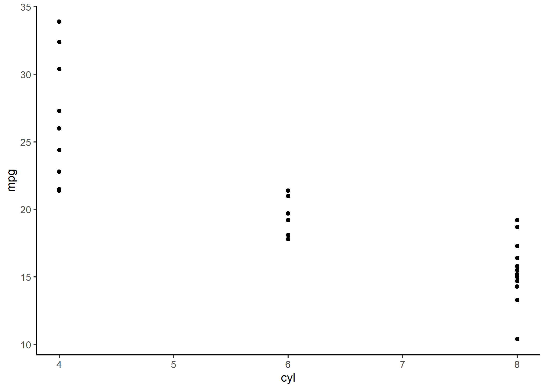
Axes limités
coord_capped_cart et coord_capped_flip de l’extension lemon permet de limiter le dessin des axes au minimum et au maximum. Voir l’exemple ci-dessous.
library(ggplot2)
library(lemon)
p <- ggplot(mtcars) +
  aes(x = cyl, y = mpg) +
  geom_point() +
  theme_classic() +
  ggtitle("Axes classiques")
pcapped <- p +
  coord_capped_cart(bottom = "both", left = "both") +
  ggtitle("Axes limités")
cowplot::plot_grid(p, pcapped, nrow = 1)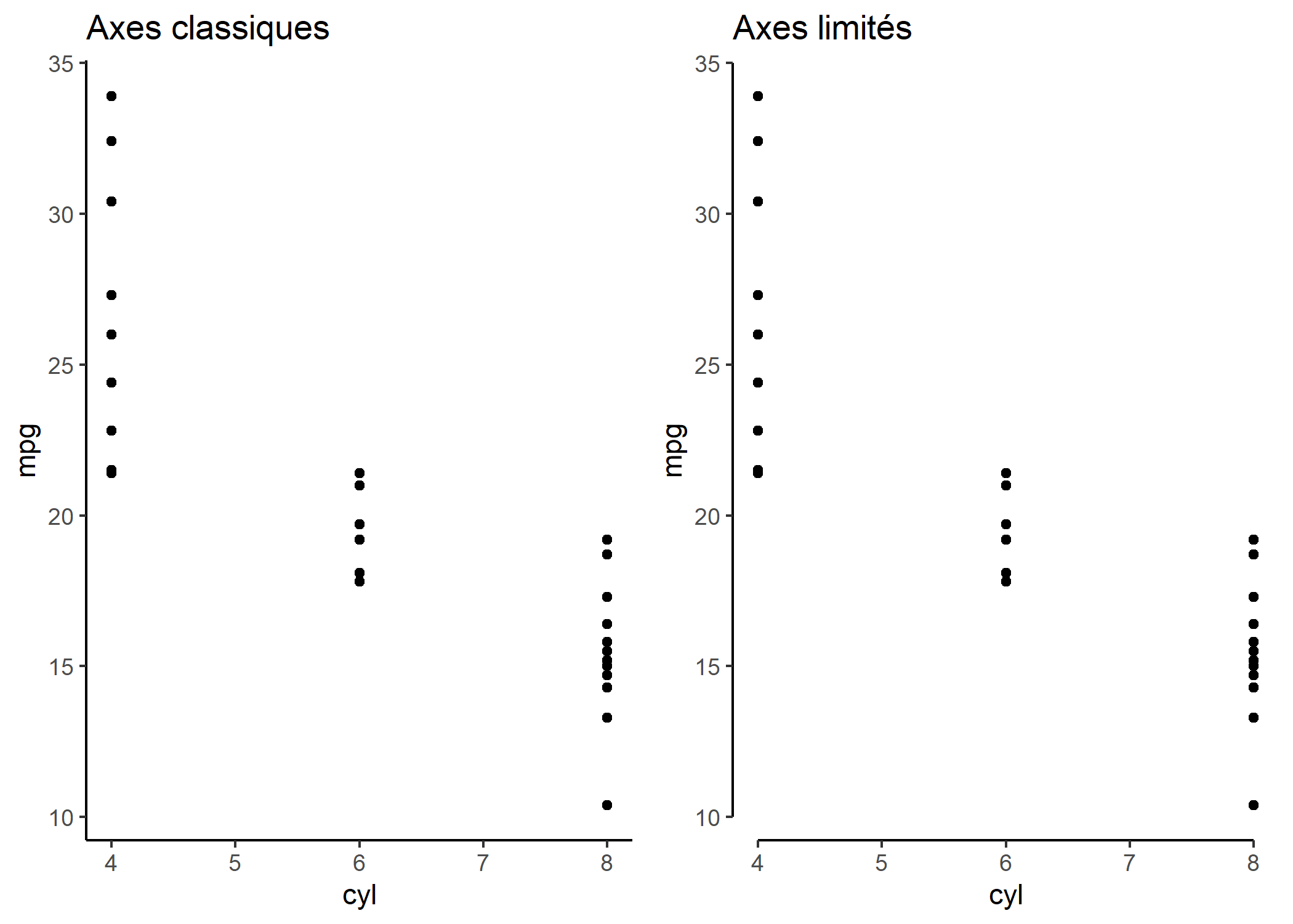
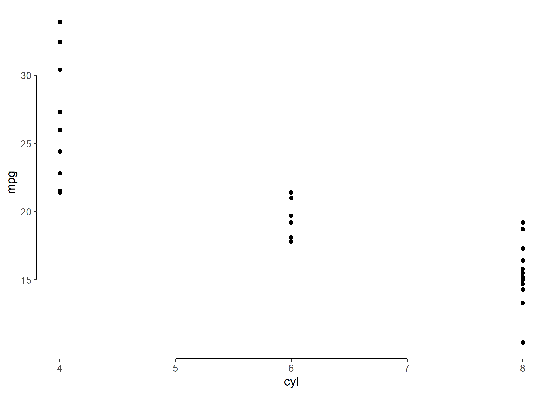
Une autre possibilité est d’avoir recours à la fonction guide_axis_truncated de l’extension ggh4x.
library(ggh4x)
ggplot(mtcars) +
  aes(x = cyl, y = mpg) +
  geom_point() +
  theme_classic() +
  scale_y_continuous(breaks = c(15, 20, 25, 30)) +
  guides(
    x = guide_axis_truncated(trunc_lower = 5, trunc_upper = 7),
    y = guide_axis_truncated()
  )
Répéter les étiquettes des axes sur des facettes
Lorsque l’on réalise des facettes, les étiquettes des axes ne sont pas répétées.
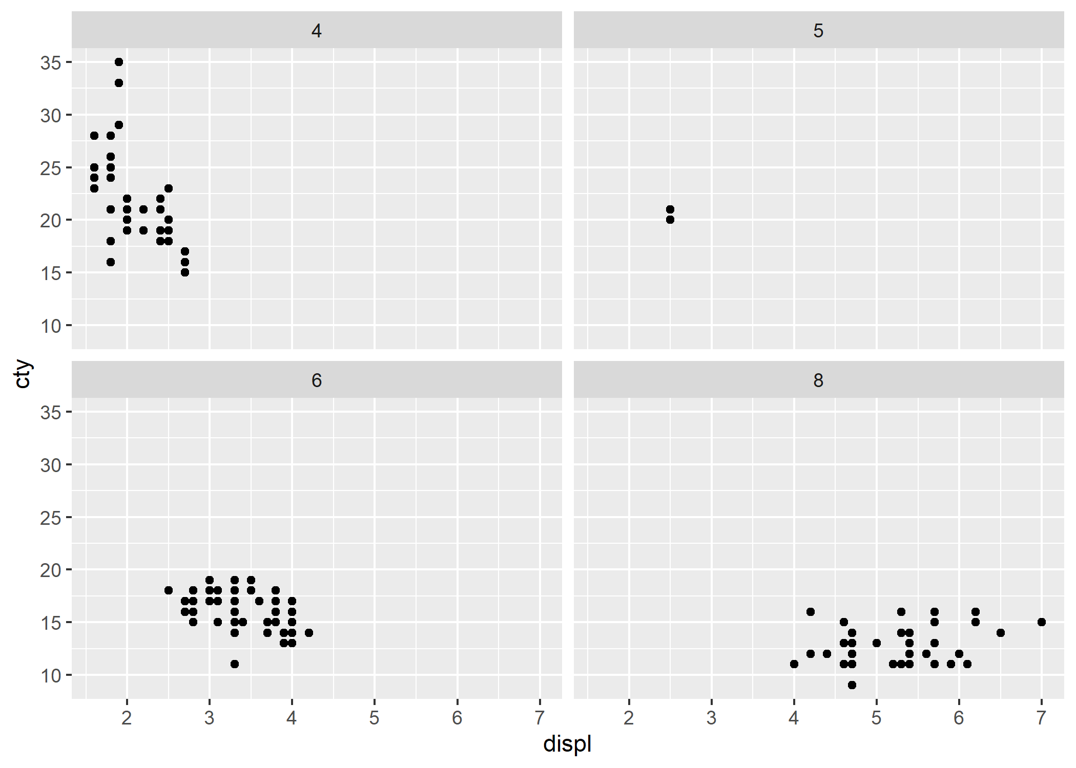
L’extension lemon propose facet_rep_grid et facet_rep_wrap qui répètent les axes sur chaque facette.
library(lemon)
ggplot(mpg) +
  aes(displ, cty) +
  geom_point() +
  facet_rep_wrap(~cyl, repeat.tick.labels = TRUE)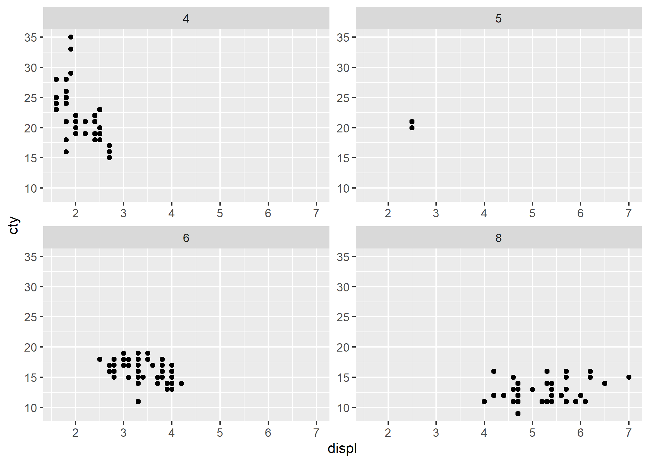
Encoches mineures sur les axes
Par défaut, des encoches (ticks) sont dessinées sur les axes uniquement pour la grille principale (major breaks). La fonction guide_axis_minor de l’extension ggh4x permet de rajouter des encoches aux points de la grille mineure (minor breaks).
library(ggh4x)
p +
  scale_x_continuous(
    minor_breaks = 16:32 / 4,
    guide = guide_axis_minor()
  ) +
  # to control relative length of minor ticks
  theme(ggh4x.axis.ticks.length.minor = rel(.8))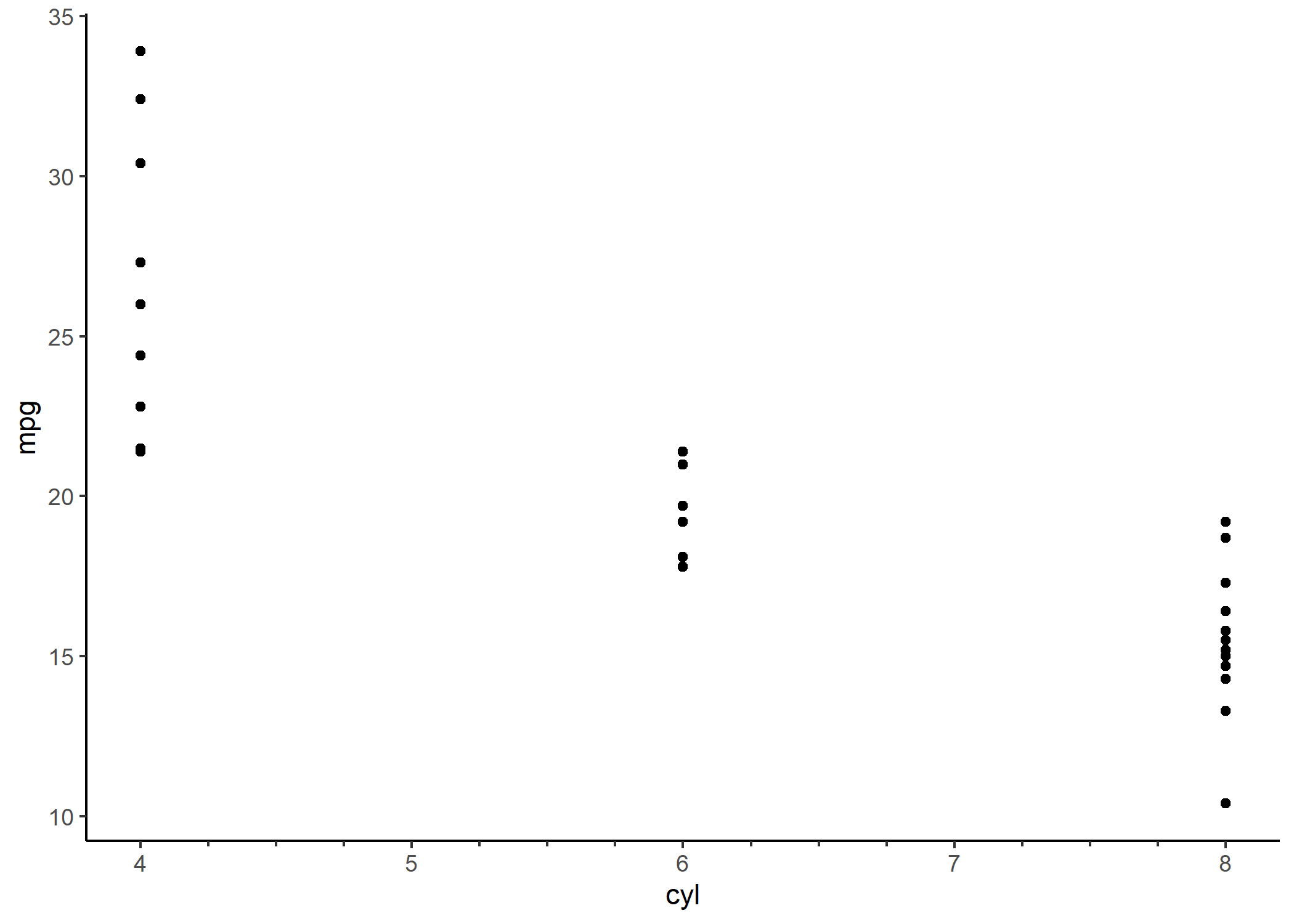
Relations imbriquées
La fonction guide_axis_nested de l’extension ggh4x permet d’afficher sur un axe des relations imbriquées.
library(ggh4x)
df <- data.frame(
  item = c("Coffee", "Tea", "Apple", "Pear", "Car"),
  type = c("Drink", "Drink", "Fruit", "Fruit", ""),
  amount = c(5, 1, 2, 3, 1),
  stringsAsFactors = FALSE
)

ggplot(df) +
  aes(x = interaction(item, type), y = amount) +
  geom_col() +
  guides(x = guide_axis_nested())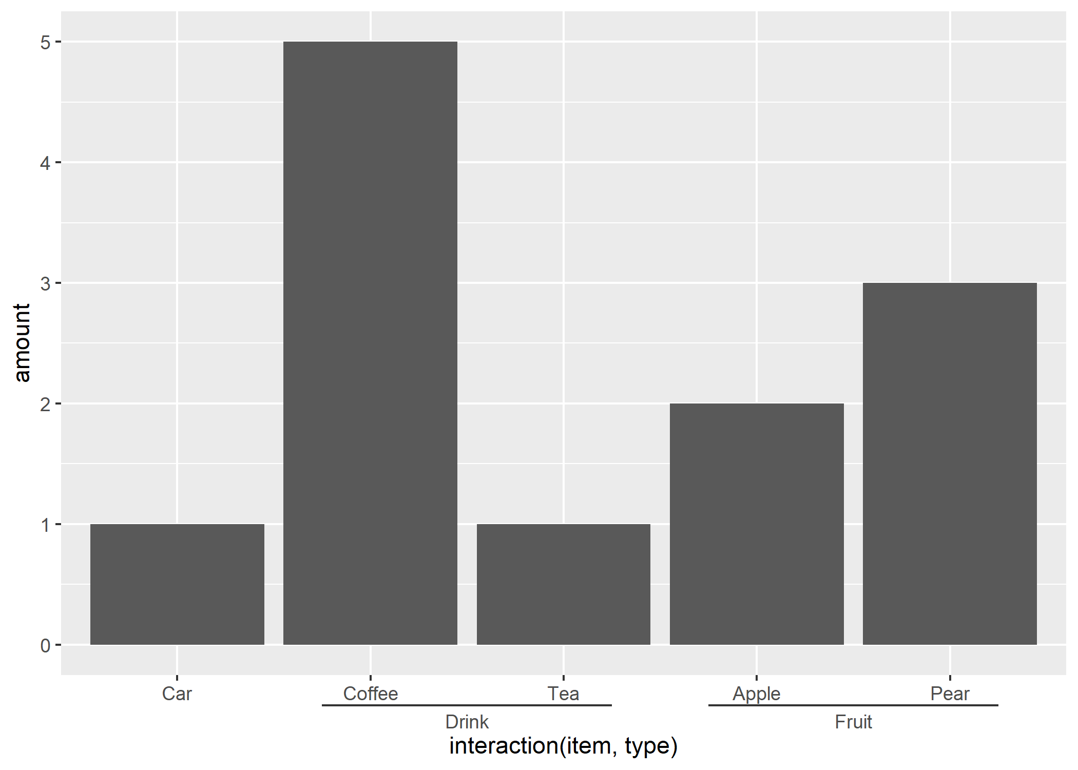
Combinaison de variables sur l’axe des X
L’extension ggupset fournie une fonction scale_x_upset permettant de représenter des combinaisons de variables sur l’axe des x, combinaisons de variables stockées sous forme d’une colonne de type liste. Pour plus d’informations, voir https://github.com/const-ae/ggupset.
library(ggupset)
library(tidyverse, quietly = TRUE)
tidy_movies %>%
  distinct(title, year, length, .keep_all = TRUE) %>%
  ggplot(aes(x = Genres)) +
  geom_bar() +
  scale_x_upset(n_intersections = 20)
Warning: Removed 100 rows containing non-finite values
(`stat_count()`).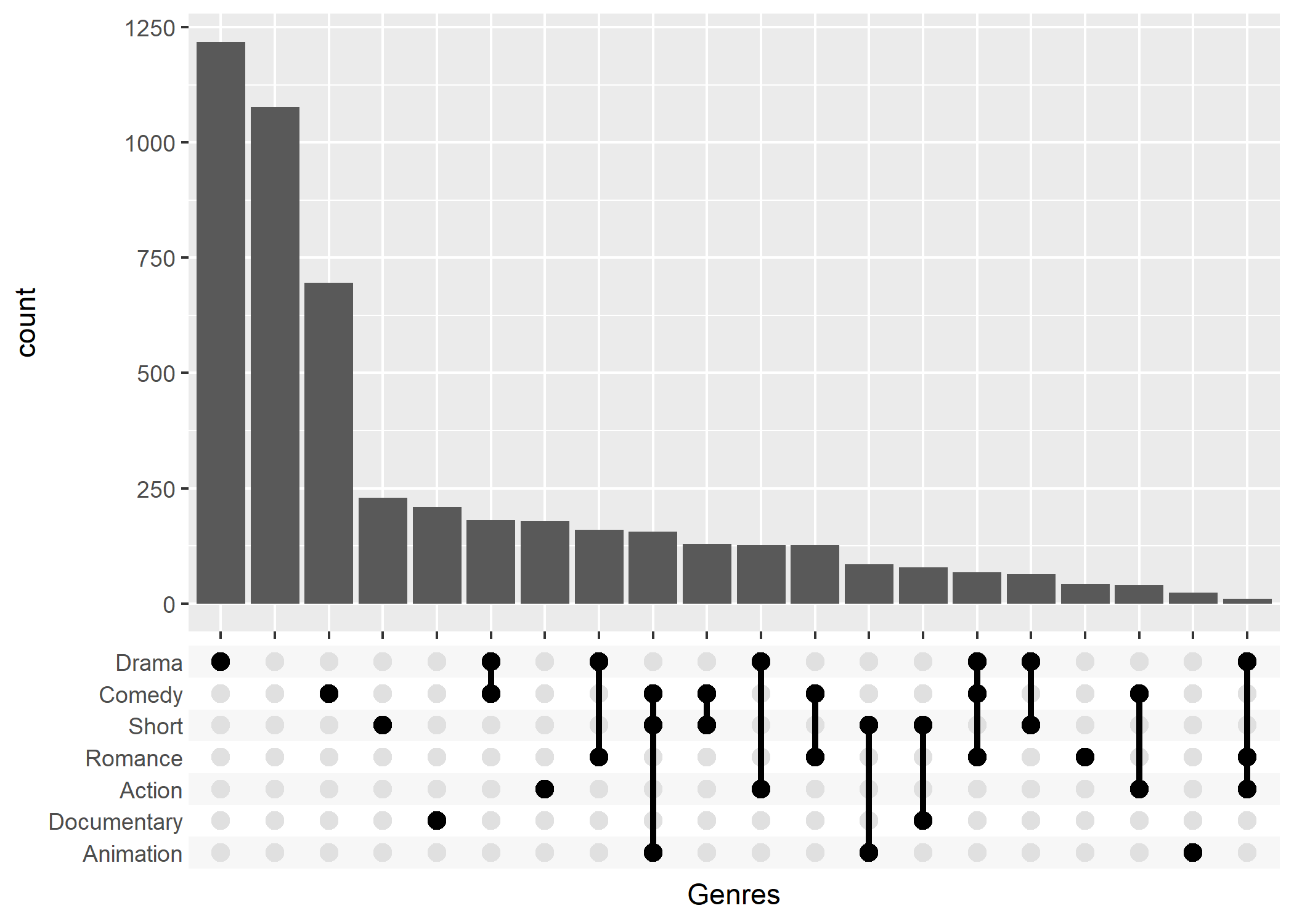 ### Zoom sur un axe
L’extension ggforce propose une fonction facet_zoom permettant de zoomer une partie d’un axe.
library(ggforce)
ggplot(iris, aes(Petal.Length, Petal.Width, colour = Species)) +
  geom_point() +
  facet_zoom(x = Species == "versicolor")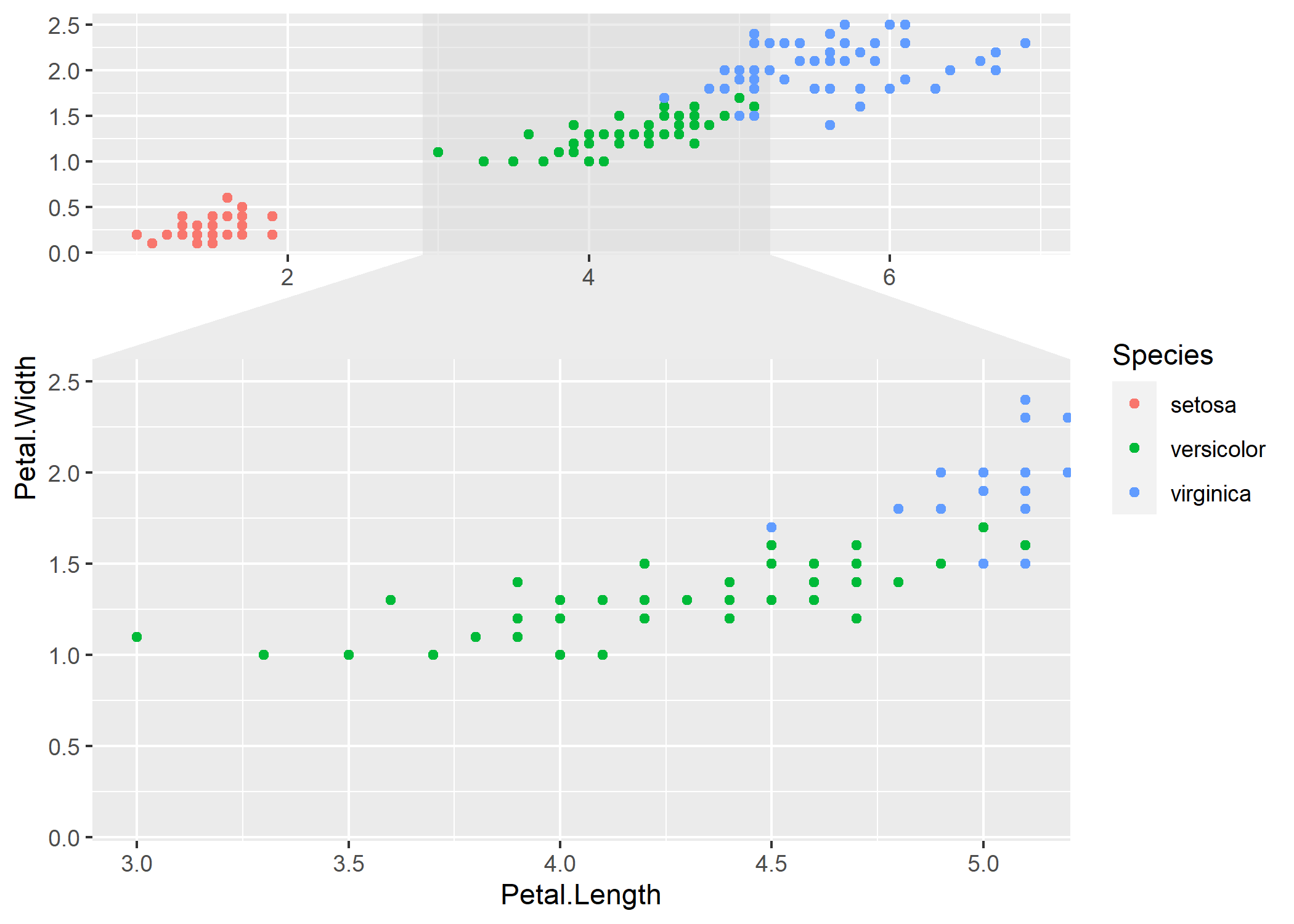
Des facettes paginées (diviser en plusieurs sous-graphiques)
Les fonctions facet_wrap_paginate et facet_grid_paginate de ggforce permet de découper facilement un graphique en facettes en plusieurs pages.
ggplot(diamonds) +
  geom_point(aes(carat, price), alpha = 0.1) +
  facet_wrap_paginate(~ cut:clarity, ncol = 3, nrow = 3, page = 1)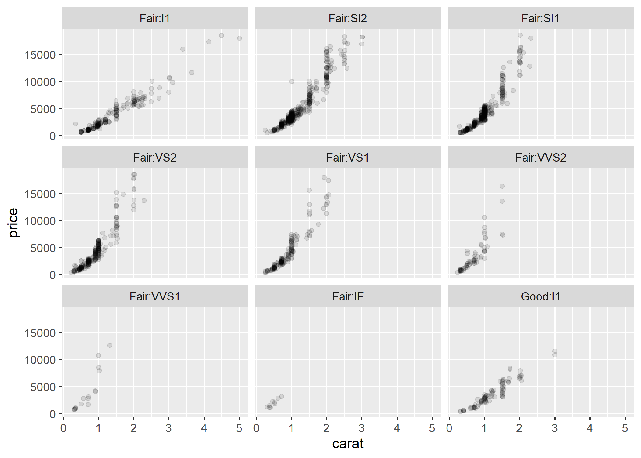
ggplot(diamonds) +
  geom_point(aes(carat, price), alpha = 0.1) +
  facet_wrap_paginate(~ cut:clarity, ncol = 3, nrow = 3, page = 2)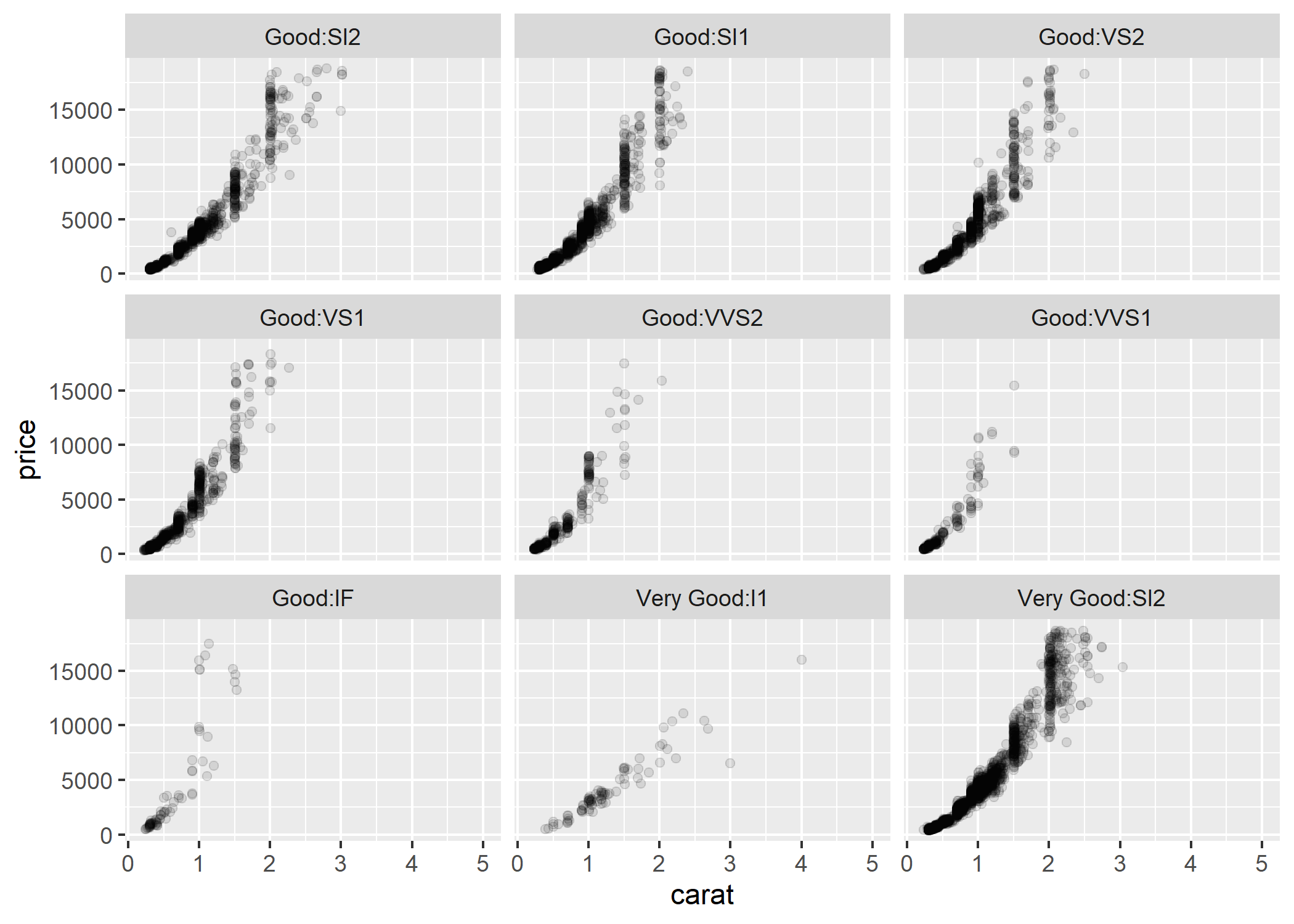
ggplot(diamonds) +
  geom_point(aes(carat, price), alpha = 0.1) +
  facet_wrap_paginate(~ cut:clarity, ncol = 3, nrow = 3, page = 3)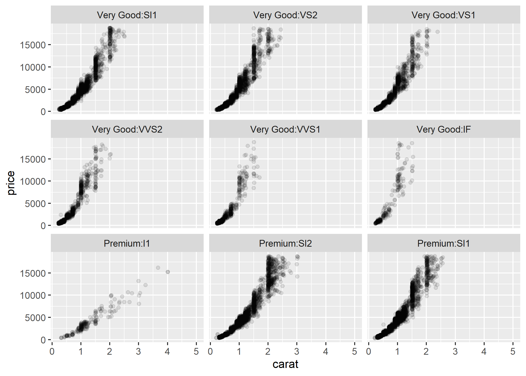
Cartes
Voir le chapitre dédié.
Graphiques complexes
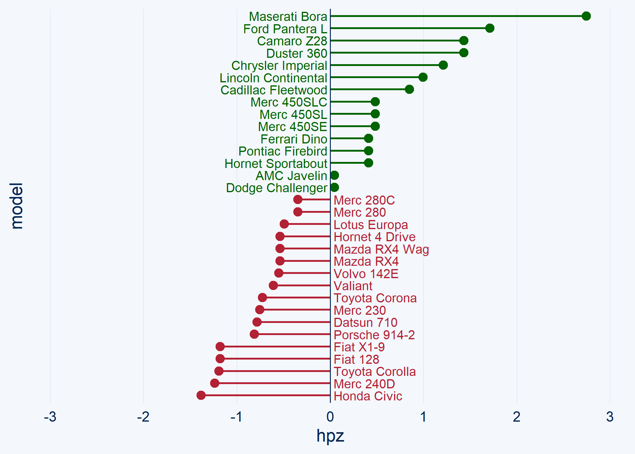
Graphiques divergents
L’extension ggcharts fournit plusieurs fonctions de haut niveau pour faciliter la réalisation de graphiques divergents en barres (diverging_bar_chart), en sucettes (diverging_lollipop_chart) voire même une pyramide des âges (pyramid_chart).
library(ggcharts)
data(mtcars)
mtcars_z <- dplyr::transmute(
  .data = mtcars,
  model = row.names(mtcars),
  hpz = scale(hp)
)

diverging_bar_chart(data = mtcars_z, x = model, y = hpz)
Warning: Using one column matrices in `filter()` was deprecated in
dplyr 1.1.0.
ℹ Please use one dimensional logical vectors instead.
ℹ The deprecated feature was likely used in the dplyr
package.
Please report the issue at
<]8;;https://github.com/tidyverse/dplyr/issueshttps://github.com/tidyverse/dplyr/issues]8;;>.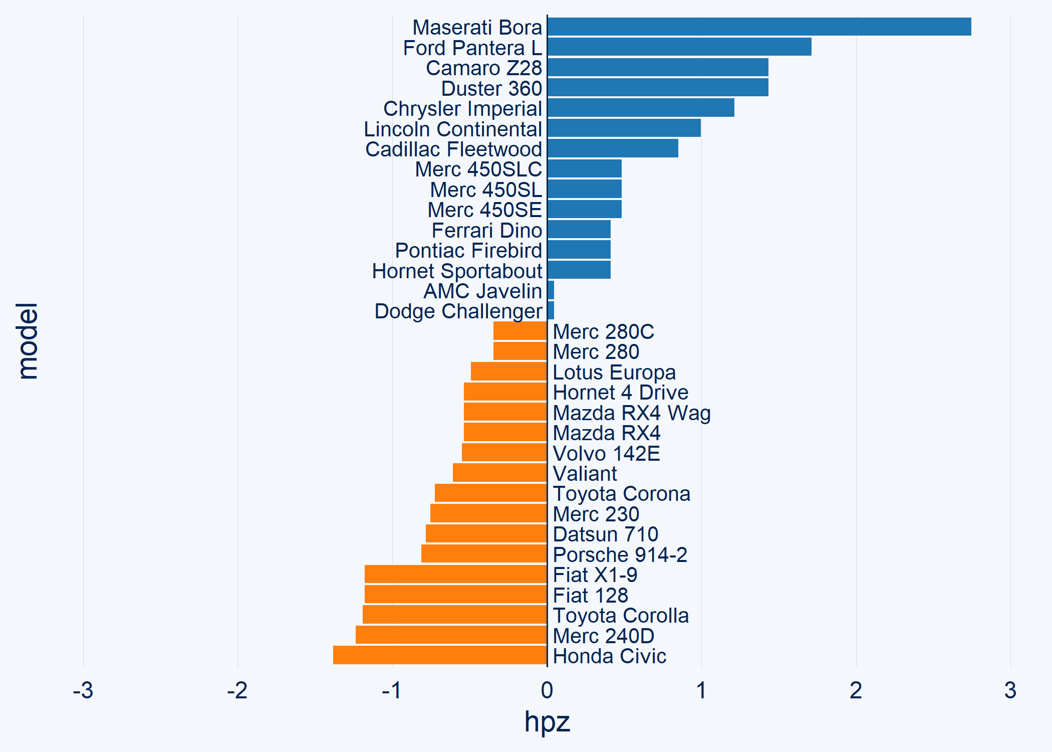
diverging_lollipop_chart(
  data = mtcars_z,
  x = model,
  y = hpz,
  lollipop_colors = c("#006400", "#b32134"),
  text_color = c("#006400", "#b32134")
)
Pyramides des âges
Plussieurs solutions sont disponible pour réaliser une pyramide des âges.
Tout d’abord, ggcharts propose une fonction pyramid_chart.
Warning: `expand_scale()` was deprecated in ggplot2 3.3.0.
ℹ Please use `expansion()` instead.
ℹ The deprecated feature was likely used in the ggcharts
  package.
  Please report the issue at
  <]8;;https://github.com/thomas-neitmann/ggcharts/issueshttps://github.com/thomas-neitmann/ggcharts/issues]8;;>.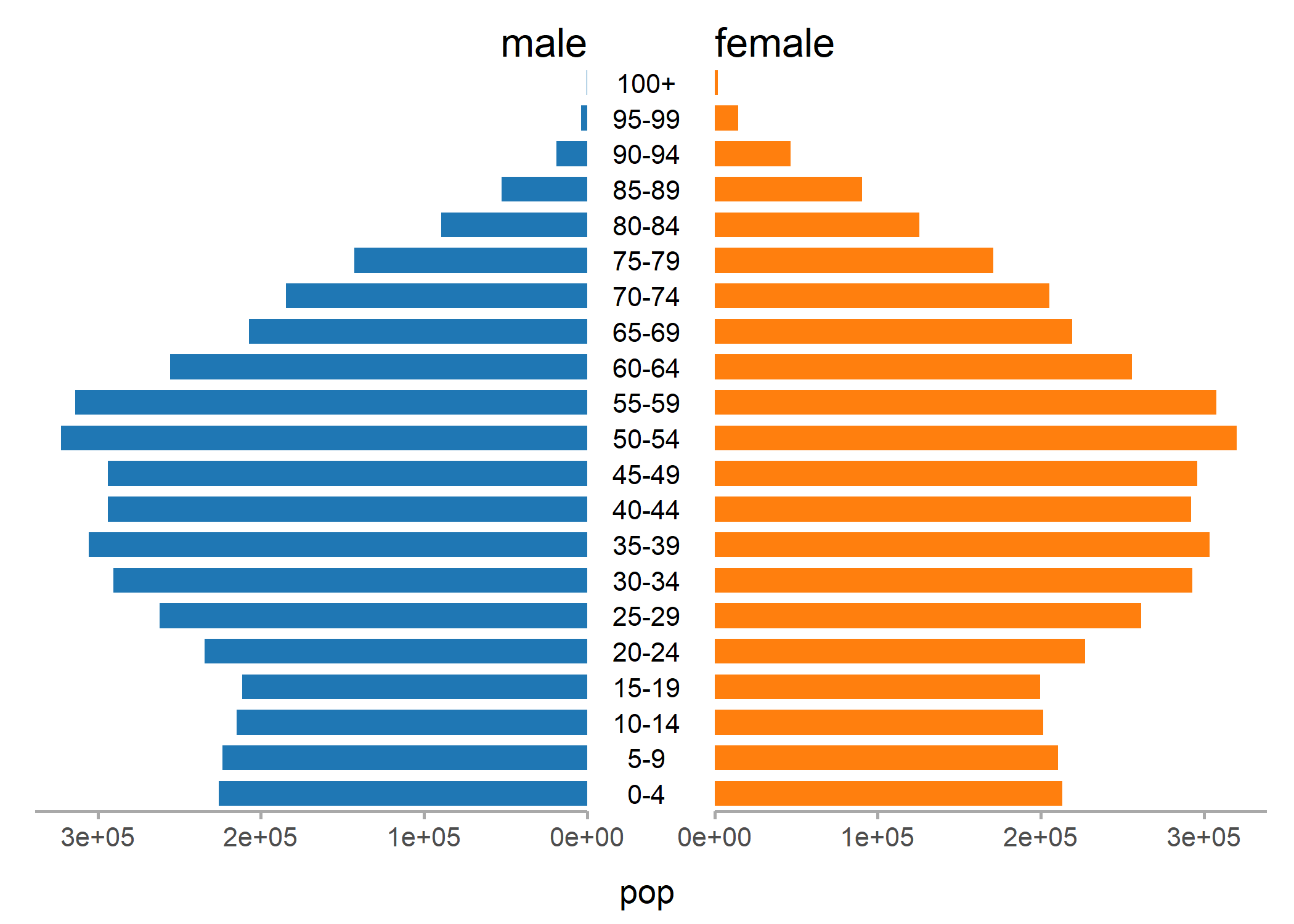
L’extension apyramid dédiée aux pyramides des âges fournit une fonction age_pyramid.
library(apyramid)
data(us_2018)
age_pyramid(us_2018, age_group = age, split_by = gender, count = count)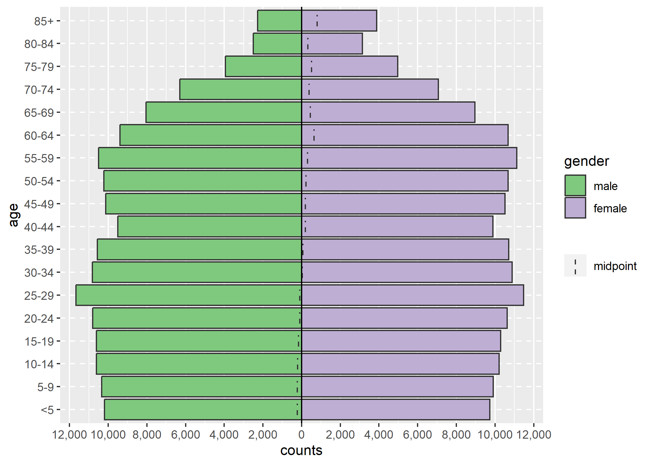
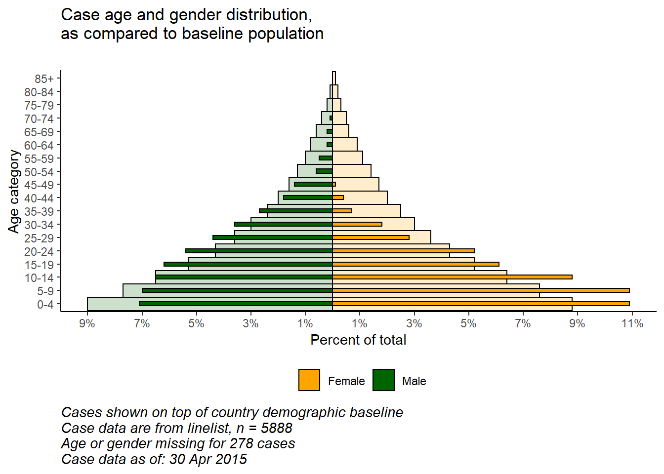
Pour aller plus loin, notamment avec ggplot2, on pourra se référer (en anglais), au chapitre dédié du Epidemiologist R Handbook, par exemple pour savoir comme réaliser deux pyramides superposées :
Graphiques interactifs
Voir le chapitre dédie.
Graphiques animés
L’extension gganimate permets de réaliser des graphiques animés.
Voici un exemple :
library(ggplot2)
library(gganimate)
library(gapminder)

ggplot(gapminder, aes(gdpPercap, lifeExp, size = pop, colour = country)) +
  geom_point(alpha = 0.7, show.legend = FALSE) +
  scale_colour_manual(values = country_colors) +
  scale_size(range = c(2, 12)) +
  scale_x_log10() +
  facet_wrap(~continent) +
  # Here comes the gganimate specific bits
  labs(title = "Year: {frame_time}", x = "GDP per capita", y = "life expectancy") +
  transition_time(year) +
  ease_aes("linear")
Rendering [------------------------] at 1.7 fps ~ eta: 1mRendering [>-----------------------] at 1.6 fps ~ eta: 1mRendering [>-----------------------] at 1.5 fps ~ eta: 1mRendering [=>----------------------] at 1.5 fps ~ eta: 1mRendering [==>---------------------] at 1.5 fps ~ eta: 1mRendering [===>--------------------] at 1.4 fps ~ eta: 1mRendering [===>--------------------] at 1.5 fps ~ eta: 1mRendering [====>-------------------] at 1.5 fps ~ eta: 1mRendering [=====>------------------] at 1.5 fps ~ eta: 1mRendering [=====>------------------] at 1.4 fps ~ eta: 1mRendering [======>-----------------] at 1.4 fps ~ eta: 50sRendering [======>-----------------] at 1.4 fps ~ eta: 49sRendering [======>-----------------] at 1.4 fps ~ eta: 48sRendering [=======>----------------] at 1.4 fps ~ eta: 47sRendering [=======>----------------] at 1.4 fps ~ eta: 46sRendering [=======>----------------] at 1.4 fps ~ eta: 45sRendering [========>---------------] at 1.3 fps ~ eta: 1mRendering [========>---------------] at 1.3 fps ~ eta: 49sRendering [========>---------------] at 1.3 fps ~ eta: 48sRendering [========>---------------] at 1.3 fps ~ eta: 47sRendering [=========>--------------] at 1.3 fps ~ eta: 46sRendering [=========>--------------] at 1.3 fps ~ eta: 45sRendering [=========>--------------] at 1.3 fps ~ eta: 44sRendering [=========>--------------] at 1.3 fps ~ eta: 43sRendering [==========>-------------] at 1.3 fps ~ eta: 43sRendering [==========>-------------] at 1.3 fps ~ eta: 42sRendering [==========>-------------] at 1.3 fps ~ eta: 41sRendering [==========>-------------] at 1.3 fps ~ eta: 40sRendering [===========>------------] at 1.3 fps ~ eta: 39sRendering [===========>------------] at 1.3 fps ~ eta: 38sRendering [===========>------------] at 1.3 fps ~ eta: 37sRendering [===========>------------] at 1.3 fps ~ eta: 36sRendering [============>-----------] at 1.3 fps ~ eta: 35sRendering [============>-----------] at 1.4 fps ~ eta: 34sRendering [============>-----------] at 1.4 fps ~ eta: 33sRendering [============>-----------] at 1.4 fps ~ eta: 32sRendering [=============>----------] at 1.4 fps ~ eta: 32sRendering [=============>----------] at 1.4 fps ~ eta: 31sRendering [=============>----------] at 1.4 fps ~ eta: 30sRendering [=============>----------] at 1.4 fps ~ eta: 29sRendering [==============>---------] at 1.4 fps ~ eta: 29sRendering [==============>---------] at 1.4 fps ~ eta: 28sRendering [==============>---------] at 1.4 fps ~ eta: 27sRendering [==============>---------] at 1.4 fps ~ eta: 26sRendering [===============>--------] at 1.4 fps ~ eta: 25sRendering [===============>--------] at 1.4 fps ~ eta: 24sRendering [===============>--------] at 1.4 fps ~ eta: 23sRendering [================>-------] at 1.4 fps ~ eta: 22sRendering [================>-------] at 1.4 fps ~ eta: 21sRendering [================>-------] at 1.4 fps ~ eta: 20sRendering [=================>------] at 1.4 fps ~ eta: 19sRendering [=================>------] at 1.4 fps ~ eta: 18sRendering [=================>------] at 1.4 fps ~ eta: 17sRendering [=================>------] at 1.4 fps ~ eta: 16sRendering [==================>-----] at 1.4 fps ~ eta: 16sRendering [==================>-----] at 1.4 fps ~ eta: 15sRendering [==================>-----] at 1.4 fps ~ eta: 14sRendering [===================>----] at 1.4 fps ~ eta: 13sRendering [===================>----] at 1.4 fps ~ eta: 12sRendering [===================>----] at 1.4 fps ~ eta: 11sRendering [====================>---] at 1.4 fps ~ eta: 10sRendering [====================>---] at 1.4 fps ~ eta: 9sRendering [====================>---] at 1.4 fps ~ eta: 8sRendering [=====================>--] at 1.4 fps ~ eta: 7sRendering [=====================>--] at 1.4 fps ~ eta: 6sRendering [=====================>--] at 1.4 fps ~ eta: 5sRendering [======================>-] at 1.4 fps ~ eta: 4sRendering [======================>-] at 1.4 fps ~ eta: 3sRendering [======================>-] at 1.4 fps ~ eta: 2sRendering [=======================>] at 1.4 fps ~ eta: 1sRendering [========================] at 1.4 fps ~ eta: 0s 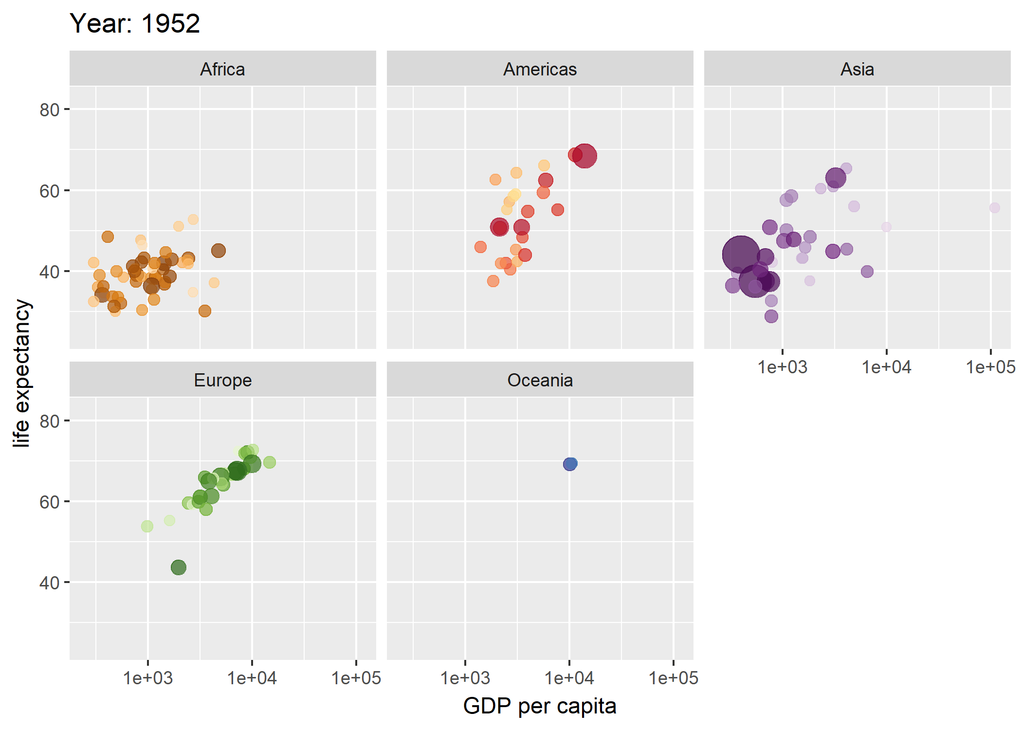
Voir le site de l’extension (https://gganimate.com/) pour la documentation et des tutoriels. Il est conseillé d’installer également l’extension gifski avec gganimate.
Surligner certaines données
L’extension gghighlight fournit une fonction gghiglight qui permets de surligner
les données qui remplissent des conditions spécifiées.
d <- purrr::map_dfr(
  letters,
  ~ data.frame(
    idx = 1:400,
    value = cumsum(runif(400, -1, 1)),
    type = .,
    flag = sample(c(TRUE, FALSE), size = 400, replace = TRUE),
    stringsAsFactors = FALSE
  )
)

ggplot(d) +
  aes(x = idx, y = value, colour = type) +
  geom_line()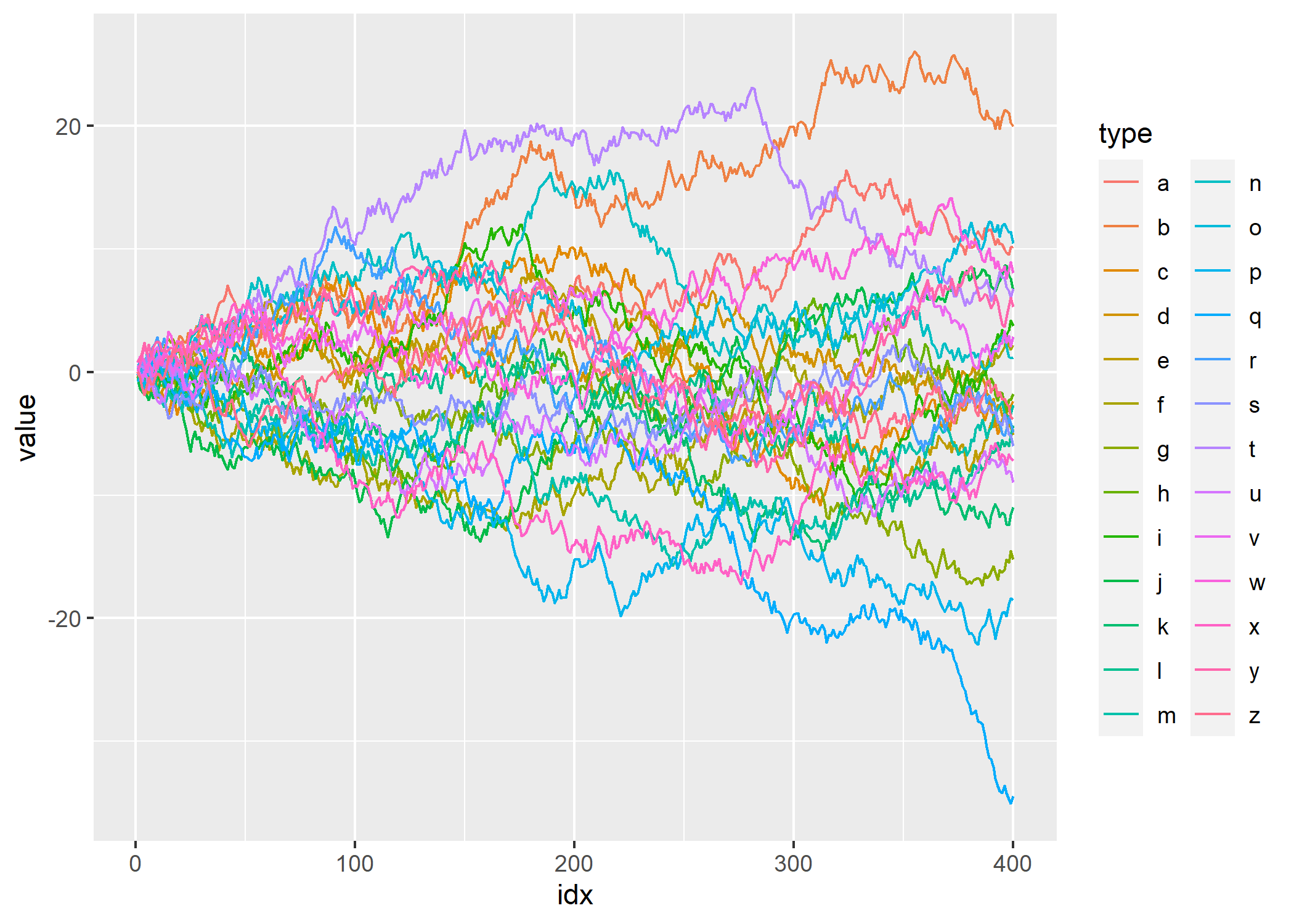
library(gghighlight)
ggplot(d) +
  aes(x = idx, y = value, colour = type) +
  geom_line() +
  gghighlight(max(value) > 20)
label_key: type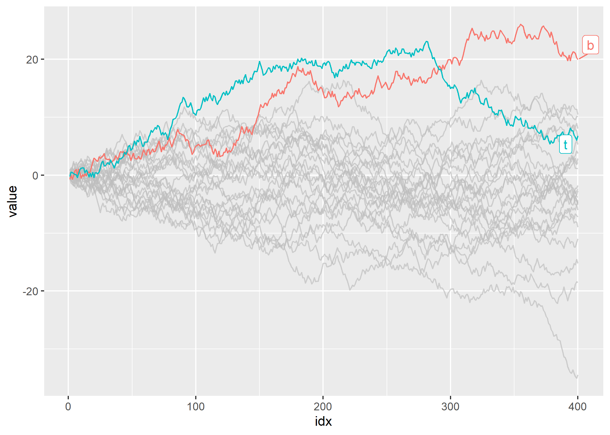
ggplot(iris, aes(Sepal.Length, fill = Species)) +
  geom_histogram() +
  gghighlight() +
  facet_wrap(~Species)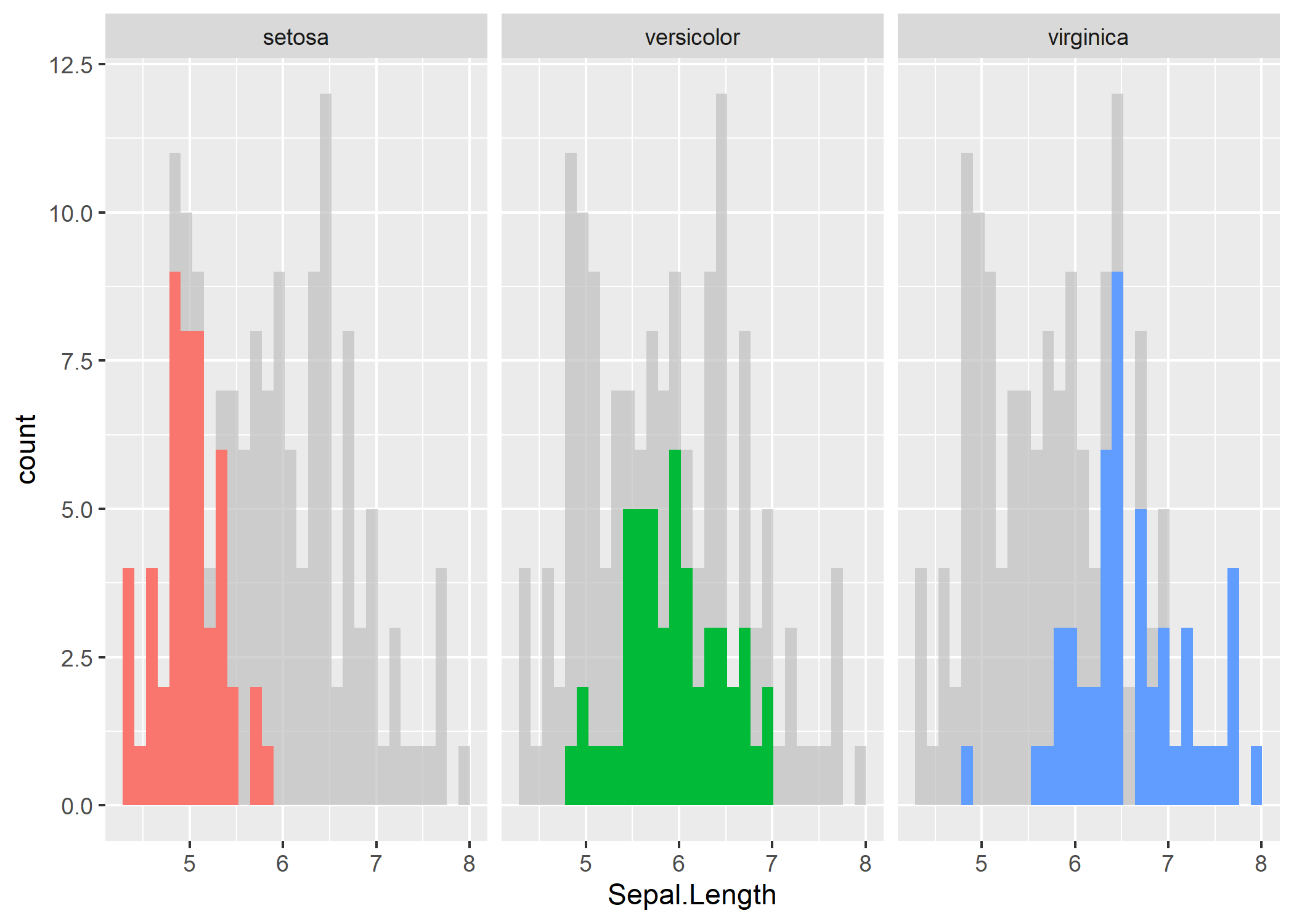
Thèmes et couleurs
Palettes de couleurs
Voir le chapitre Couleurs et palettes pour une sélection d’extensions proposant des palettes de couleurs additionnelles.
hrbrthemes
L’extension hrbrthemes fournit plusieurs thèmes graphiques pour ggplot2. Un exemple ci-dessous. Pour plus d’informations, voir https://github.com/hrbrmstr/hrbrthemes.
library(ggplot2)
library(hrbrthemes)
ggplot(mtcars, aes(mpg, wt)) +
  geom_point(aes(color = factor(carb))) +
  labs(
    x = "Fuel efficiency (mpg)", y = "Weight (tons)",
    title = "Seminal ggplot2 scatterplot example",
    subtitle = "A plot that is only useful for demonstration purposes",
    caption = "Brought to you by the letter 'g'"
  ) +
  scale_color_ipsum() +
  theme_ipsum_rc()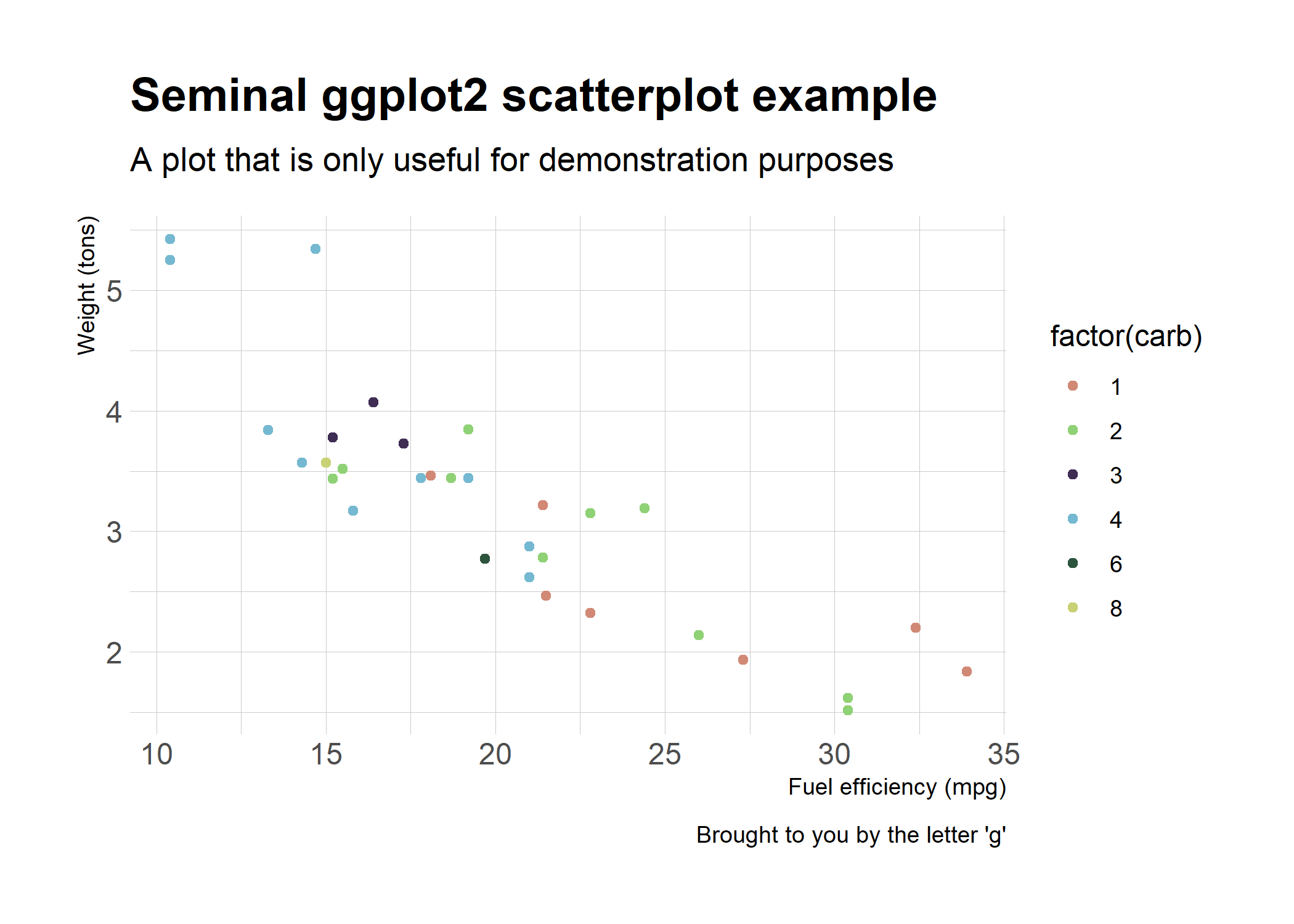
ggthemes
ggthemes propose une vingtaine de thèmes différentes présentés sur le site de l’extension : https://jrnold.github.io/ggthemes/.
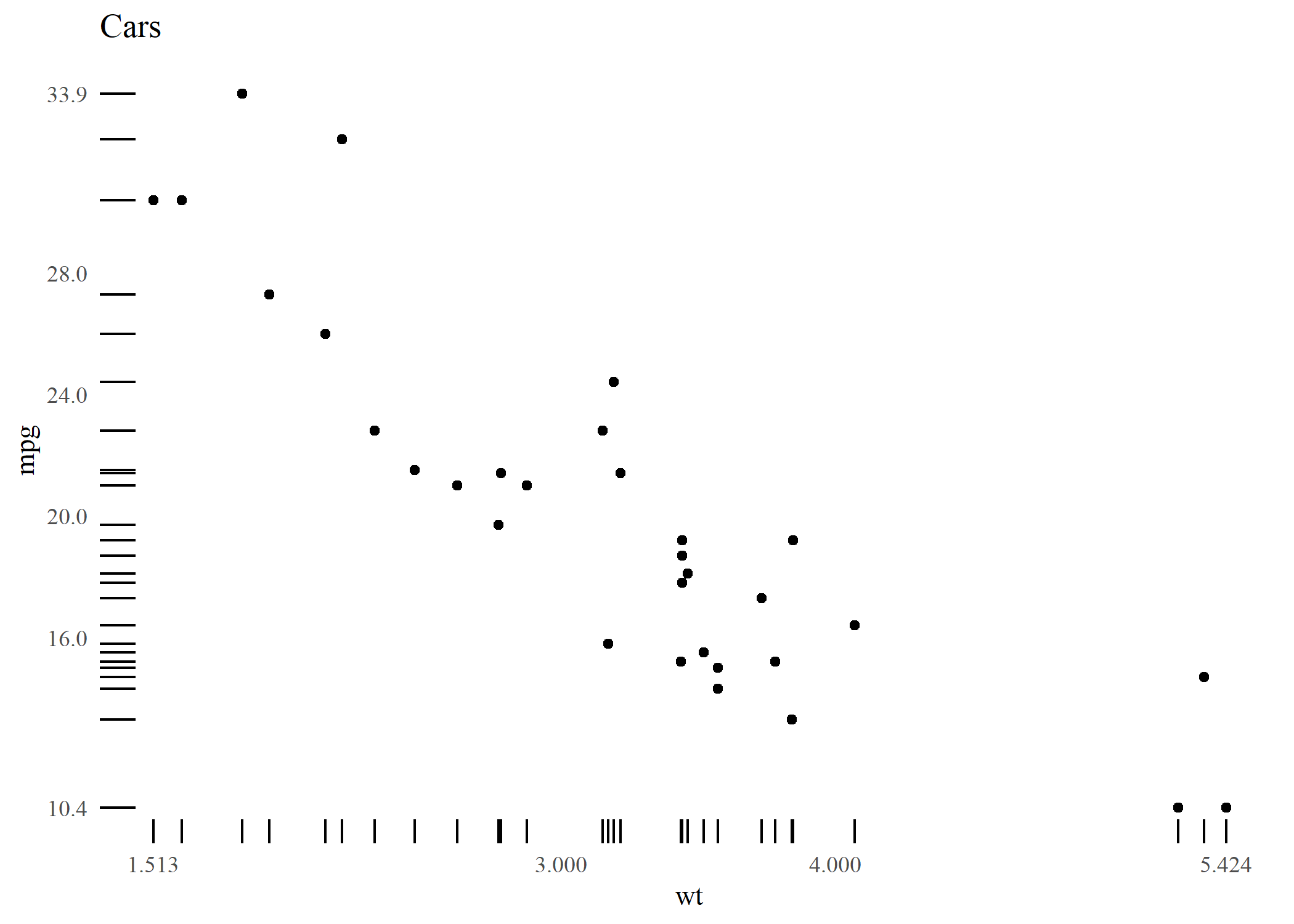
Voir ci-dessous un exemple du thème theme_tufte inspiré d’Edward Tufte.
library(ggplot2)
library(ggthemes)

p <- ggplot(mtcars, aes(x = wt, y = mpg)) +
  geom_point() +
  scale_x_continuous(breaks = extended_range_breaks()(mtcars$wt)) +
  scale_y_continuous(breaks = extended_range_breaks()(mtcars$mpg)) +
  ggtitle("Cars")

p + geom_rangeframe() +
  theme_tufte()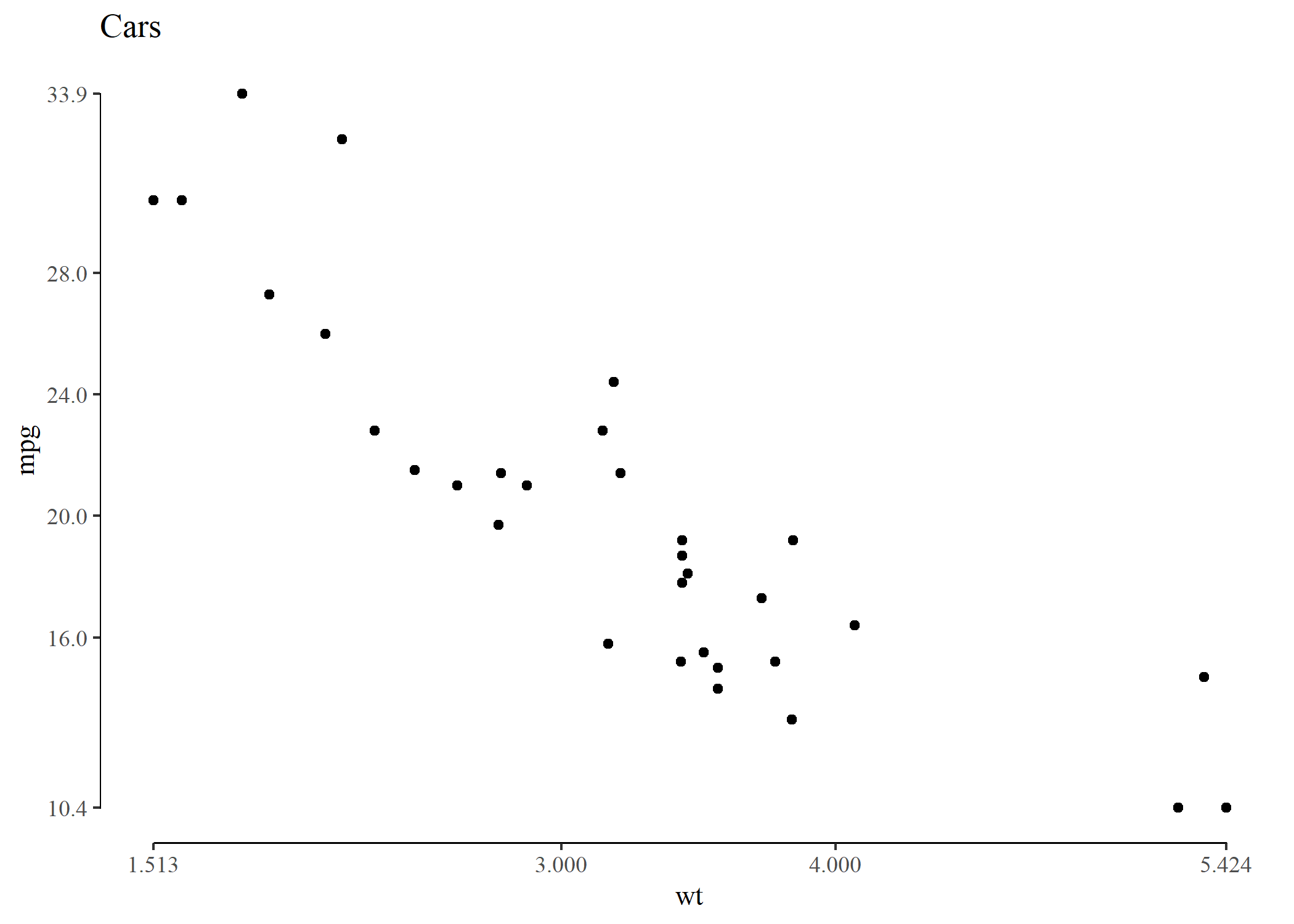
Combiner plusieurs graphiques
Voir le chapitre dédié.
Cette extension n’étant pas sur CRAN, on l’installera avec la commande
devtools::install_github("mikabr/ggpirate").↩︎