
Autres extensions graphiques
Pour trouver l’inspiration et des exemples de code, rien ne vaut l’excellent site https://www.r-graph-gallery.com/.
GGally
L’extension GGally, déjà abordée dans d’autres chapitres, fournit plusieurs fonctions graphiques d’exploration des résultats d’un modèle ou des relations entre variables.
reg <- lm(Sepal.Length ~ Sepal.Width + Petal.Length + Petal.Width, data = iris)
library(GGally)
ggcoef_model(reg)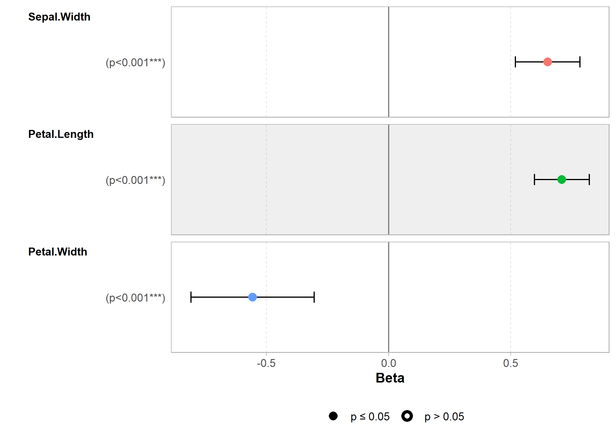
Plus d’information : https://ggobi.github.io/ggally/
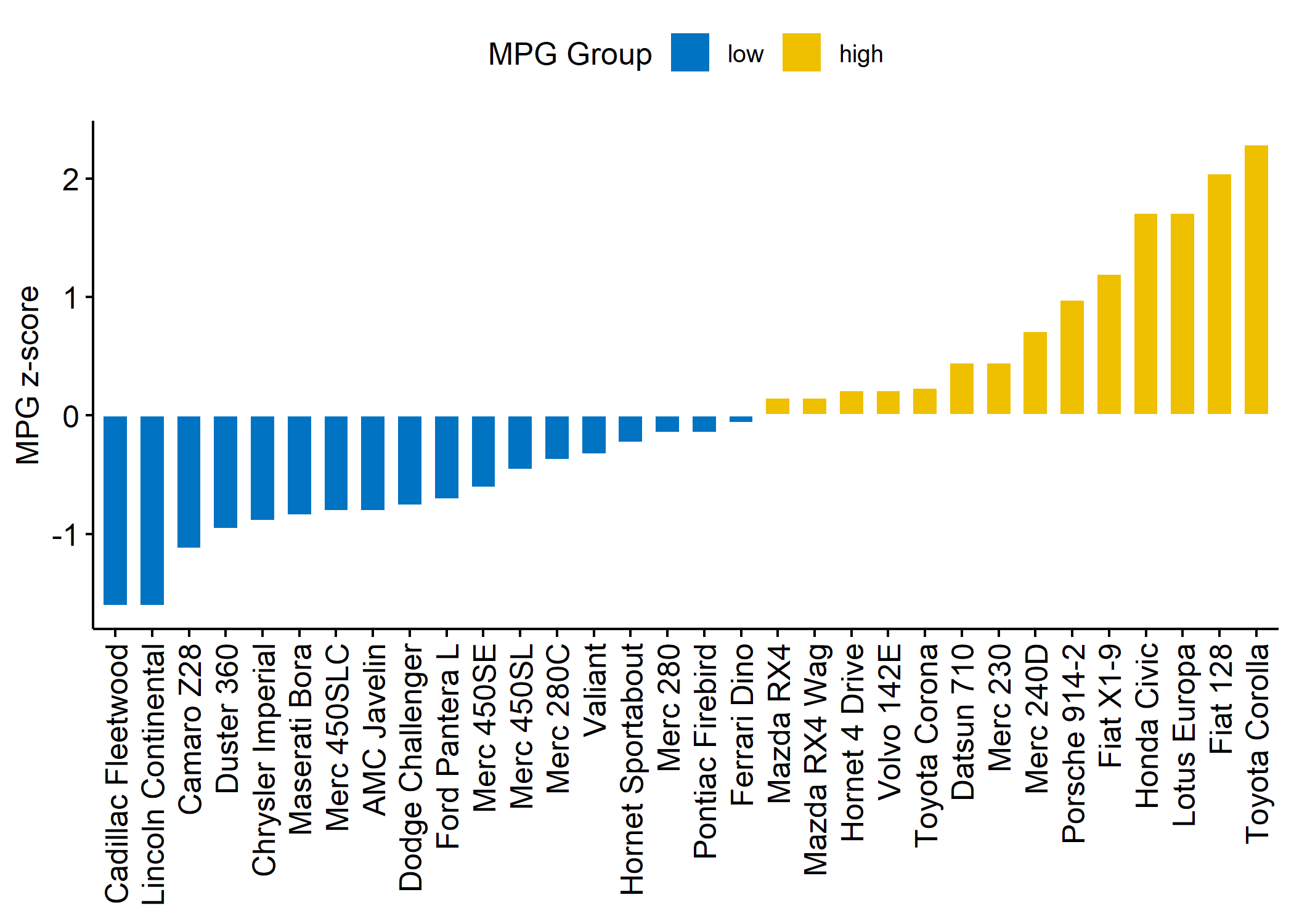
ggpubr
L’extension ggpubr fournit plusieurs fonctions pour produire clés en main
différents graphiques bivariés avec une mise en forme allégée.
library(ggpubr)
data("ToothGrowth")
df <- ToothGrowth
ggboxplot(df,
  x = "dose", y = "len",
  color = "dose", palette = c("#00AFBB", "#E7B800", "#FC4E07"),
  add = "jitter", shape = "dose"
)
data("mtcars")
dfm <- mtcars
# Convert the cyl variable to a factor
dfm$cyl <- as.factor(dfm$cyl)
# Add the name colums
dfm$name <- rownames(dfm)
# Calculate the z-score of the mpg data
dfm$mpg_z <- (dfm$mpg - mean(dfm$mpg)) / sd(dfm$mpg)
dfm$mpg_grp <- factor(ifelse(dfm$mpg_z < 0, "low", "high"),
  levels = c("low", "high")
)

ggbarplot(dfm,
  x = "name", y = "mpg_z",
  fill = "mpg_grp", # change fill color by mpg_level
  color = "white", # Set bar border colors to white
  palette = "jco", # jco journal color palett. see ?ggpar
  sort.val = "asc", # Sort the value in ascending order
  sort.by.groups = FALSE, # Don't sort inside each group
  x.text.angle = 90, # Rotate vertically x axis texts
  ylab = "MPG z-score",
  xlab = FALSE,
  legend.title = "MPG Group"
)
ggdotchart(dfm,
  x = "name", y = "mpg_z",
  color = "cyl", # Color by groups
  palette = c("#00AFBB", "#E7B800", "#FC4E07"), # Custom color palette
  sorting = "descending", # Sort value in descending order
  add = "segments", # Add segments from y = 0 to dots
  add.params = list(color = "lightgray", size = 2), # Change segment color and size
  group = "cyl", # Order by groups
  dot.size = 6, # Large dot size
  label = round(dfm$mpg_z, 1), # Add mpg values as dot labels
  font.label = list(
    color = "white", size = 9,
    vjust = 0.5
  ), # Adjust label parameters
  ggtheme = theme_pubr() # ggplot2 theme
) +
  geom_hline(yintercept = 0, linetype = 2, color = "lightgray")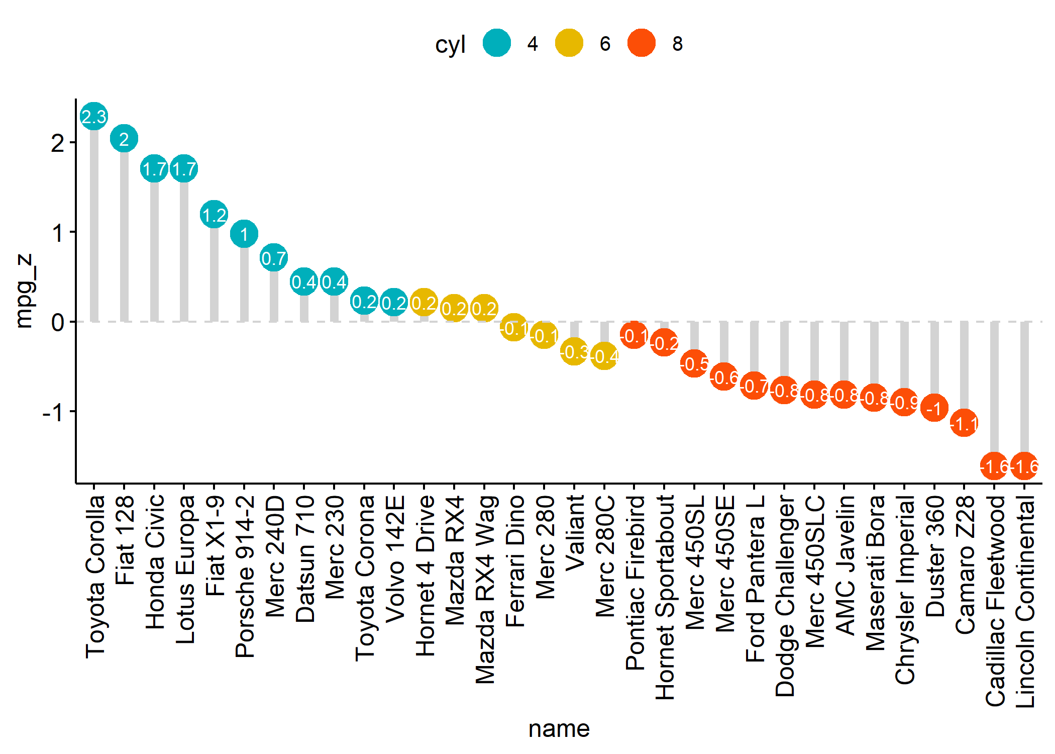
Plus d’informations : https://rpkgs.datanovia.com/ggpubr/
ggdendro
L’extension ggendro avec sa fonction ggdendrogram permet de représenter facilement des dendrogrammes avec ggplot2.
library(ggplot2)
library(ggdendro)
hc <- hclust(dist(USArrests), "ave")
hcdata <- dendro_data(hc, type = "rectangle")
ggplot() +
  geom_segment(data = segment(hcdata), aes(x = x, y = y, xend = xend, yend = yend)) +
  geom_text(data = label(hcdata), aes(x = x, y = y, label = label, hjust = 0), size = 3) +
  coord_flip() +
  scale_y_reverse(expand = c(0.2, 0))
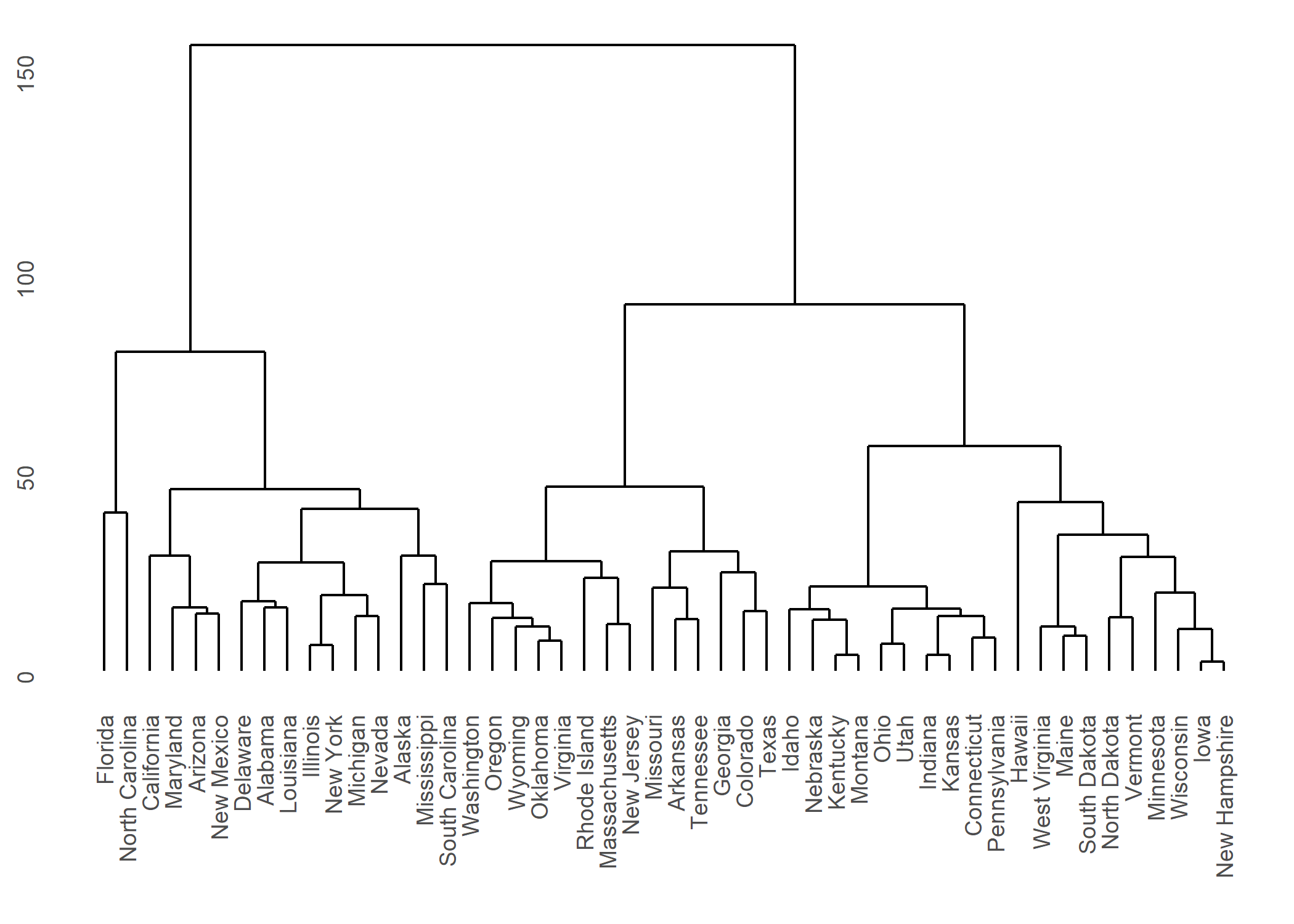
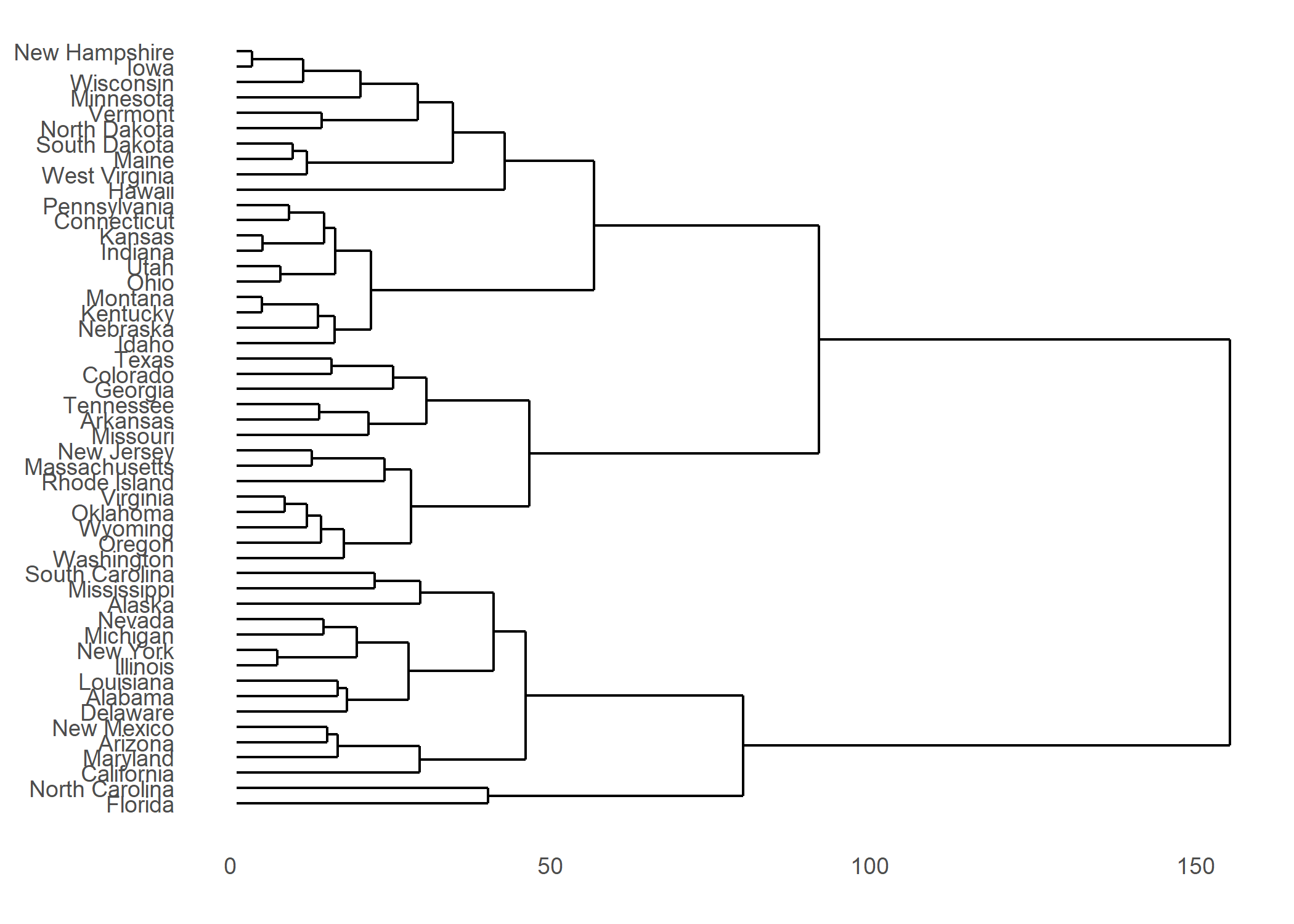
Plus d’informations : https://cran.r-project.org/web/packages/ggdendro/vignettes/ggdendro.html
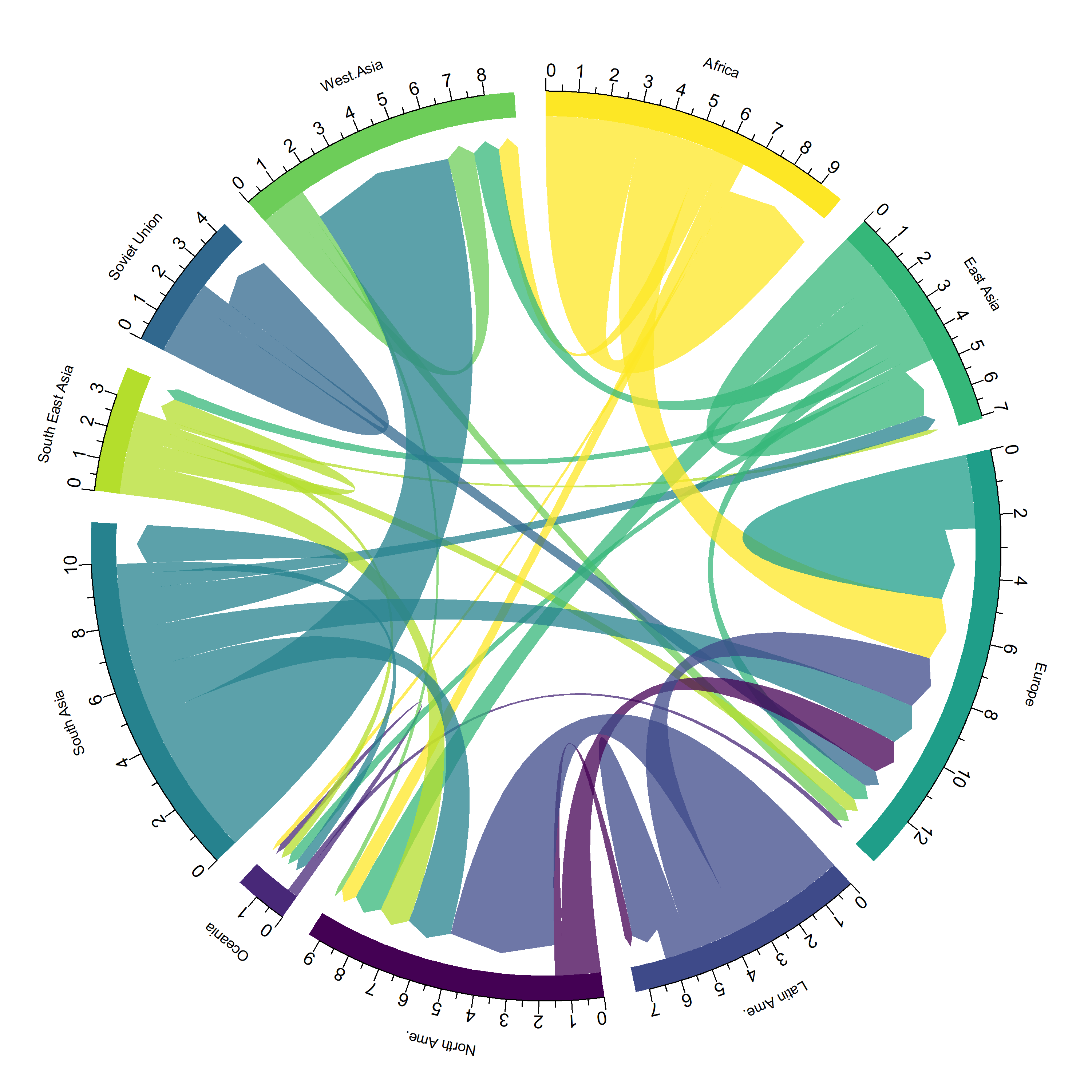
circlize
L’extension circlize est l’extension de référence quand il s’agit de représentations circulaires. Un ouvrage entier lui est dédié : https://jokergoo.github.io/circlize_book/book/.
Voici un exemple issu de https://www.data-to-viz.com/story/AdjacencyMatrix.html.
── Attaching packages ─────────────────── tidyverse 1.3.2 ──
✔ tibble  3.1.8     ✔ purrr   1.0.1
✔ readr   2.1.3     ✔ forcats 1.0.0
── Conflicts ────────────────────── tidyverse_conflicts() ──
✖ lubridate::as.difftime() masks base::as.difftime()
✖ dplyr::between()         masks data.table::between()
✖ lubridate::date()        masks base::date()
✖ dplyr::filter()          masks stats::filter()
✖ dplyr::first()           masks data.table::first()
✖ lubridate::hour()        masks data.table::hour()
✖ lubridate::intersect()   masks base::intersect()
✖ lubridate::isoweek()     masks data.table::isoweek()
✖ dplyr::lag()             masks stats::lag()
✖ dplyr::last()            masks data.table::last()
✖ lubridate::mday()        masks data.table::mday()
✖ lubridate::minute()      masks data.table::minute()
✖ lubridate::month()       masks data.table::month()
✖ lubridate::quarter()     masks data.table::quarter()
✖ lubridate::second()      masks data.table::second()
✖ lubridate::setdiff()     masks base::setdiff()
✖ purrr::transpose()       masks data.table::transpose()
✖ lubridate::union()       masks base::union()
✖ lubridate::wday()        masks data.table::wday()
✖ lubridate::week()        masks data.table::week()
✖ lubridate::yday()        masks data.table::yday()
✖ lubridate::year()        masks data.table::year()
# Load data
data <- read.table("https://raw.githubusercontent.com/holtzy/data_to_viz/master/Example_dataset/13_AdjacencyDirectedWeighted.csv", header = TRUE)
# short names
colnames(data) <- c("Africa", "East Asia", "Europe", "Latin Ame.", "North Ame.", "Oceania", "South Asia", "South East Asia", "Soviet Union", "West.Asia")
rownames(data) <- colnames(data)
# I need a long format
data_long <- data %>%
rownames_to_column() %>%
gather(key = "key", value = "value", -rowname)
library(circlize)========================================
circlize version 0.4.15
CRAN page: https://cran.r-project.org/package=circlize
Github page: https://github.com/jokergoo/circlize
Documentation: https://jokergoo.github.io/circlize_book/book/
If you use it in published research, please cite:
Gu, Z. circlize implements and enhances circular visualization
in R. Bioinformatics 2014.
This message can be suppressed by:
suppressPackageStartupMessages(library(circlize))
========================================# parameters
circos.clear()
circos.par(start.degree = 90, gap.degree = 4, track.margin = c(-0.1, 0.1), points.overflow.warning = FALSE)
par(mar = rep(0, 4))
# color palette
library(viridis)Le chargement a nécessité le package : viridisLitemycolor <- viridis(10, alpha = 1, begin = 0, end = 1, option = "D")
mycolor <- mycolor[sample(1:10)]
# Base plot
chordDiagram(
x = data_long,
grid.col = mycolor,
transparency = 0.25,
directional = 1,
direction.type = c("arrows", "diffHeight"),
diffHeight = -0.04,
annotationTrack = "grid",
annotationTrackHeight = c(0.05, 0.1),
link.arr.type = "big.arrow",
link.sort = TRUE,
link.largest.ontop = TRUE
)
# Add text and axis
circos.trackPlotRegion(
track.index = 1,
bg.border = NA,
panel.fun = function(x, y) {
xlim <- get.cell.meta.data("xlim")
sector.index <- get.cell.meta.data("sector.index")
# Add names to the sector.
circos.text(
x = mean(xlim),
y = 3.2,
labels = sector.index,
facing = "bending",
cex = 0.8
)
# Add graduation on axis
circos.axis(
h = "top",
major.at = seq(from = 0, to = xlim[2], by = ifelse(test = xlim[2] > 10, yes = 2, no = 1)),
minor.ticks = 1,
major.tick.length = 0.5,
labels.niceFacing = FALSE
)
}
)
Diagrammes de Sankey
Les diagrammes de Sankey sont un type alternatif de représentation de flux. Voici un premier exemple, qui reprend les données utilisées pour le diagramme circulaire précédent, avec la fonction sankeyNetwork de l’extension sankeyNetwork.
# Package
library(networkD3)

# I need a long format
data_long <- data %>%
  rownames_to_column() %>%
  gather(key = "key", value = "value", -rowname) %>%
  filter(value > 0)
colnames(data_long) <- c("source", "target", "value")
data_long$target <- paste(data_long$target, " ", sep = "")

# From these flows we need to create a node data frame: it lists every entities involved in the flow
nodes <- data.frame(name = c(as.character(data_long$source), as.character(data_long$target)) %>% unique())

# With networkD3, connection must be provided using id, not using real name like in the links dataframe.. So we need to reformat it.
data_long$IDsource <- match(data_long$source, nodes$name) - 1
data_long$IDtarget <- match(data_long$target, nodes$name) - 1

# prepare colour scale
ColourScal <- 'd3.scaleOrdinal() .range(["#FDE725FF","#B4DE2CFF","#6DCD59FF","#35B779FF","#1F9E89FF","#26828EFF","#31688EFF","#3E4A89FF","#482878FF","#440154FF"])'

# Make the Network
sankeyNetwork(
  Links = data_long, Nodes = nodes,
  Source = "IDsource", Target = "IDtarget",
  Value = "value", NodeID = "name",
  sinksRight = FALSE, colourScale = ColourScal, nodeWidth = 40, fontSize = 13, nodePadding = 20
)
Une alternative possible est fournie par l’extension ggalluvial et ses géométries geom_alluvium et geom_stratum.
library(ggalluvial)
ggplot(data = as.data.frame(Titanic)) +
  aes(axis1 = Class, axis2 = Sex, axis3 = Age, y = Freq) +
  scale_x_discrete(limits = c("Class", "Sex", "Age"), expand = c(.1, .05)) +
  xlab("Demographic") +
  geom_alluvium(aes(fill = Survived)) +
  geom_stratum() +
  geom_text(stat = "stratum", infer.label = TRUE) +
  theme_minimal()
Warning: The parameter `infer.label` is deprecated.
Use `aes(label = after_stat(stratum))`.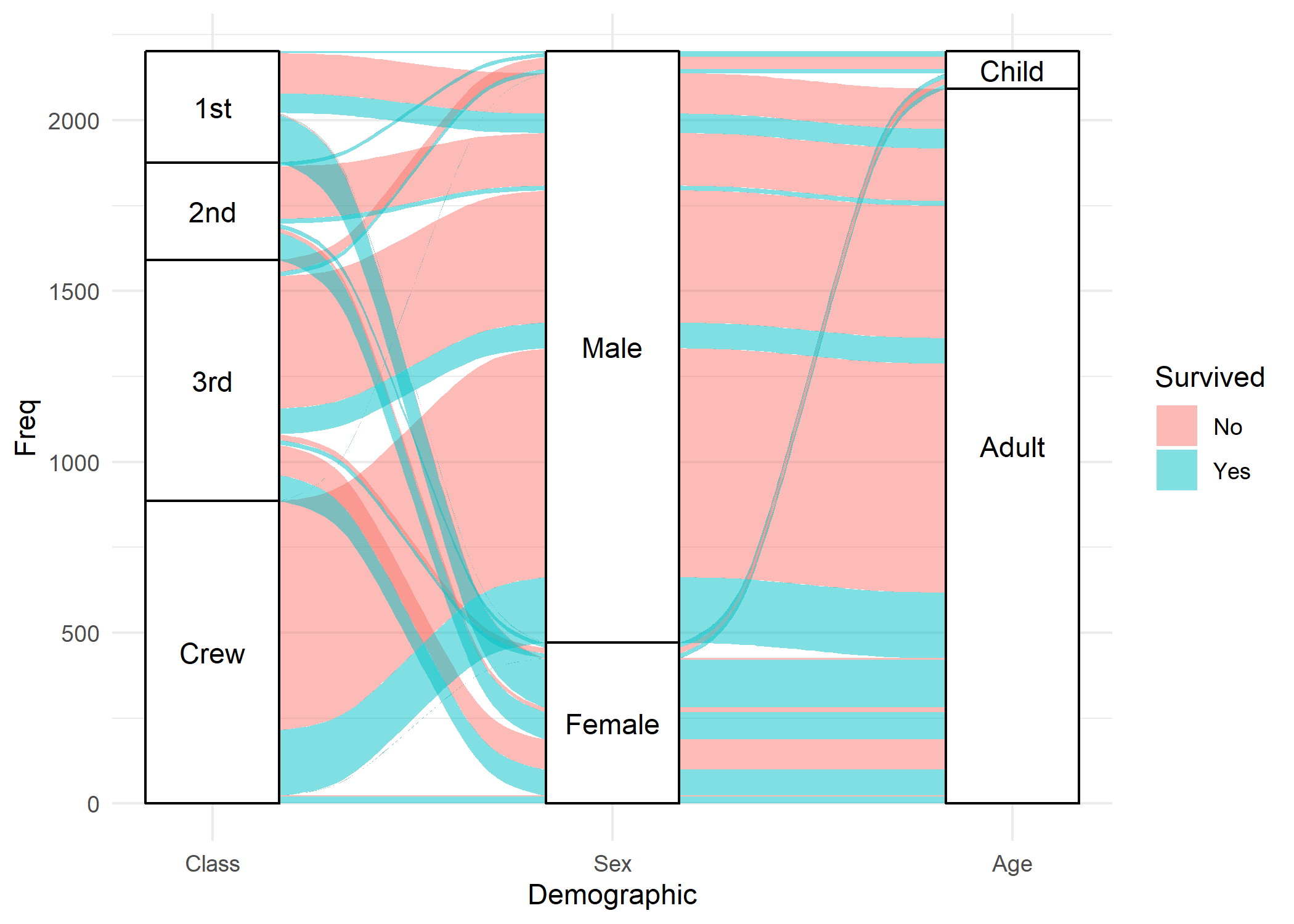
Mentionnons également l’extension riverplot pour la création de diagrammes de Sankey.
DiagrammeR
DiagrammeR est dédiée à la réalisation de diagrammes en ayant recours à la syntaxe Graphviz (via la fonction grViz) ou encore à la syntaxe Mermaid (via la fonction mermaid).
library(DiagrammeR)
grViz("
digraph boxes_and_circles {

  # a 'graph' statement
  graph [overlap = true, fontsize = 10]

  # several 'node' statements
  node [shape = box,
        fontname = Helvetica]
  A; B; C; D; E; F

  node [shape = circle,
        fixedsize = true,
        width = 0.9] // sets as circles
  1; 2; 3; 4; 5; 6; 7; 8

  # several 'edge' statements
  A->1 B->2 B->3 B->4 C->A
  1->D E->A 2->4 1->5 1->F
  E->6 4->6 5->7 6->7 3->8
}
")mermaid("
graph LR
A(Rounded)-->B[Rectangular]
B-->C{A Rhombus}
C-->D[Rectangle One]
C-->E[Rectangle Two]
")mermaid("
sequenceDiagram
customer->>ticket seller: ask ticket
ticket seller->>database: seats
alt tickets available
database->>ticket seller: ok
ticket seller->>customer: confirm
customer->>ticket seller: ok
ticket seller->>database: book a seat
ticket seller->>printer: print ticket
else sold out
database->>ticket seller: none left
ticket seller->>customer: sorry
end
")mermaid("
gantt
dateFormat YYYY-MM-DD
title Adding GANTT diagram functionality to mermaid
section A section
Completed task :done, des1, 2014-01-06,2014-01-08
Active task :active, des2, 2014-01-09, 3d
Future task : des3, after des2, 5d
Future task2 : des4, after des3, 5d
section Critical tasks
Completed task in the critical line :crit, done, 2014-01-06,24h
Implement parser and jison :crit, done, after des1, 2d
Create tests for parser :crit, active, 3d
Future task in critical line :crit, 5d
Create tests for renderer :2d
Add to mermaid :1d
section Documentation
Describe gantt syntax :active, a1, after des1, 3d
Add gantt diagram to demo page :after a1 , 20h
Add another diagram to demo page :doc1, after a1 , 48h
section Last section
Describe gantt syntax :after doc1, 3d
Add gantt diagram to demo page :20h
Add another diagram to demo page :48h
")Plus d’informations : https://rich-iannone.github.io/DiagrammeR/
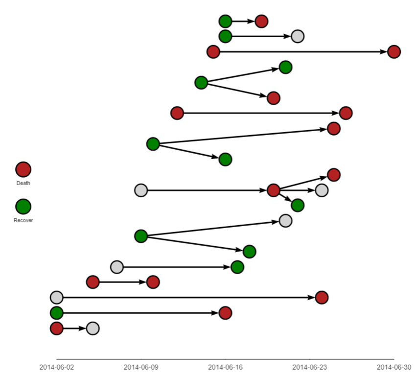
epicontacts
L’extension epicontacts permets de représenter des chaînes de transmission épidémiques.
Pour aller plus loin, on pourra se référer (en anglais), au chapitre dédié du Epidemiologist R Handbook :
highcharter
L’extension highcharter permet de réaliser des graphiques HTML utilisant la librairie Javascript Highcharts.js.
library("highcharter")
data(diamonds, mpg, package = "ggplot2")

hchart(mpg, "scatter", hcaes(x = displ, y = hwy, group = class))library(tidyverse)
library(highcharter)
mpgman3 <- mpg %>%
group_by(manufacturer) %>%
dplyr::summarise(n = n(), unique = length(unique(model))) %>%
arrange(-n, -unique)
hchart(mpgman3, "treemap", hcaes(x = manufacturer, value = n, color = unique))data(unemployment)
hcmap("countries/us/us-all-all",
data = unemployment,
name = "Unemployment", value = "value", joinBy = c("hc-key", "code"),
borderColor = "transparent"
) %>%
hc_colorAxis(dataClasses = color_classes(c(seq(0, 10, by = 2), 50))) %>%
hc_legend(
layout = "vertical", align = "right",
floating = TRUE, valueDecimals = 0, valueSuffix = "%"
)Plus d’informations : http://jkunst.com/highcharter/.